60% is your dominant hue, 30% is a secondary hue, and 10% is for an accent (typically the primary color).
This is a good rule of thumb with most UI design, especially when you’re first starting out.
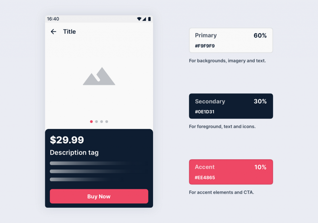
The rule is super simple and goes like this:
60% of your space is for your primary/area color;
30% Is your secondary/supportive color;
10% Is your accent and guiding color.
Why do ALL this work before implementing color in UI?
Research reveals people make a subconscious judgment about a product within 90 seconds of viewing and that between 62% and 90% of that assessment is based on color alone.
There are elements of UI design that benefit from a more scientific approach. While art can always be subjective, color theory and interface standards are rooted in science.