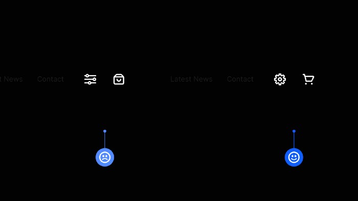
Use established icons in your UIs to avoid confusion for the user.
When adding icons to your designs, always try and choose an established icon that represents the action about to be taken.
Choose an icon that conveys the correct meaning and functionality, as anything else invites confusion and becomes a cognitive obstacle for the user.
4pt Baseline Grid + 8pt Grid = Harmonious Vertical Rhythm.
When working with Type, using a 4pt Baseline alongside the ever-versatile 8pt Grid can bring a much more harmonious vertical rhythm to your designs.
You need to align your Type to a Baseline Grid of 4, using a line-height value that is a multiple of 4 (16, 20, 24, 28 etc…)
Why 4? Well, I’ve found that scaling in multiples of 8 in the past is just not as versatile when working with certain text sizes.
4pt Baseline Grid + 8pt Grid = Sweet Vertical Harmony.
Use weight, size, and color to indicate hierarchy within your type.
When working with Type, elements don’t need to scream “Look at me!” all the time. But they need to have a balanced hierarchy in place.
Just subtle adjustments via the use of weight, size, and color is all it takes to achieve this. This allows the user to scan and find essential elements, avoiding confusion in the process.
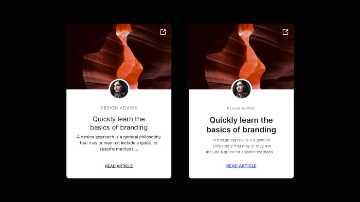
White Space. Use it generously.
Whitespace. Negative Space.
Same thing. Different titles.
My advice to you. Use it generously or in moderation, but use it well.
Lay out your icons consistently when using the 8pt Grid System.
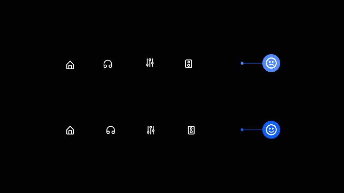
When working with icons and the 8pt Grid System, you’ll find that most well-built icon sets have icons that sit inside frames that are multiples of 8 (i.e. 16×16, 24×24, 32×32 etc…)
Sometimes, just sometimes, that’s not always the case.
If not, make sure that any icon inserted into your design you frame it inside a container that uses an 8pt Grid value (i.e. 24×24).
Doing this will enable your icons to be laid out consistently within your designs.
Inform the user on what’s going to happen if they apply a certain action.
Always try and inform the user, in detail, before applying a particular action that can have consequences.
This applies especially to actions with irreversible consequences, such as permanently deleting something.
Let the user know what’s going to happen and ask them for confirmation before they go pressing that big, red button labelled ‘Delete The Internet’.
Make sure your most important screens get priority in the Tab Bar.
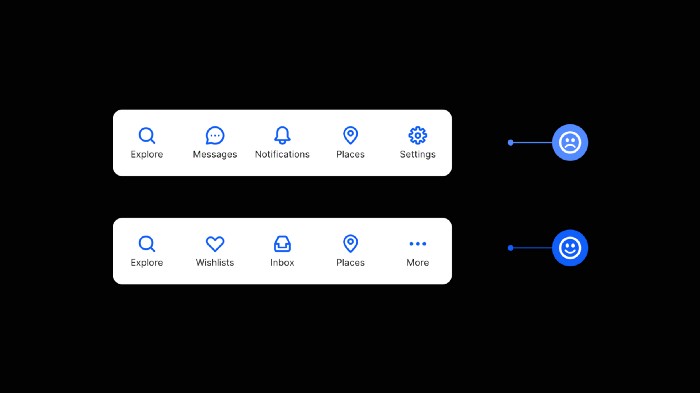
The Tab Bar in your App is a prime piece of screen real estate, so use it wisely.
Reserve the Tab Bar for the most frequently used screens of your App and hide secondary screens inside a More icon.
There’s only room for the important stuff inside of that teeny-tiny Tab Bar.
Try and create generous tappable areas on Mobile.
When designing for mobile, try to make Tappable Areas large enough for fingers to tap successfully.
The minimum recommended Tap Area for both iOS and Android is –
44 x 44pt for iOS
48 x 48dp for Android
Our fingers come in various sizes, so give them some room and make it easy for the user to tap accurately without too much frustration.
Don’t just choose font sizes at random. Use a Type Scale.
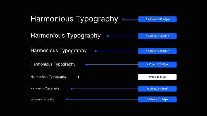
When you need to define a collection of font sizes fast, practically, and without any guesswork, use a Type Scale.
As the name implies, a Type Scale operates on a scale factor (say, 1.25).
The approach is to start with a Base font size (ie; 18px) and multiply (or divide) it by the scale factor (ie; 1.25) to get font sizes of a higher (ie; H1, H2, H3, etc.) or lower hierarchy (ie; Caption, Button, etc.).
Using a Type Scale will help you create texts that look harmonious and quickly bring consistency, rhythm, and hierarchy to your typography.
Prompt initial user action with helpful empty states.
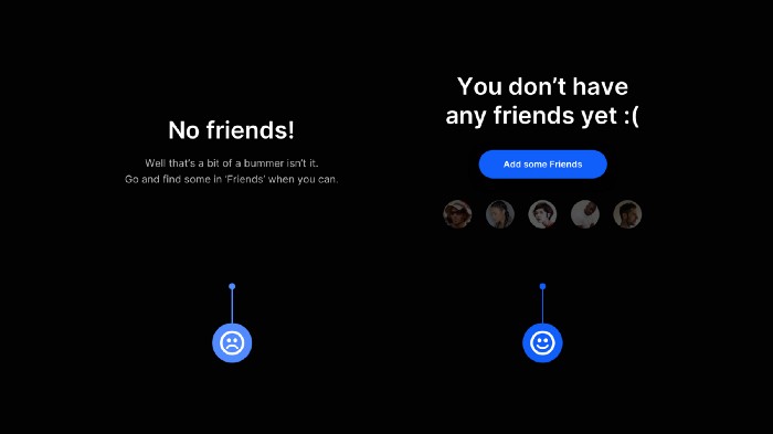
Empty states. Highly beneficial in improving the user experience but so often neglected.
Use empty states as an opportunity for the user to quickly discover features that will benefit them, get them to accomplish their goals sooner, and use the site or app as you intended.
Please don’t leave your user at a loss on what to do first, and start them off on the right foot.
Set your line-height based on the Typeface’s x-height for optimal readability.
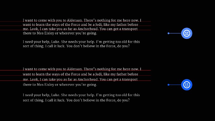
Typefaces with differing x-heights need, well, different line-height measurements to achieve optimal readability and legibility
To determine the readability of your chosen typeface, use the x-height or Il1 test.
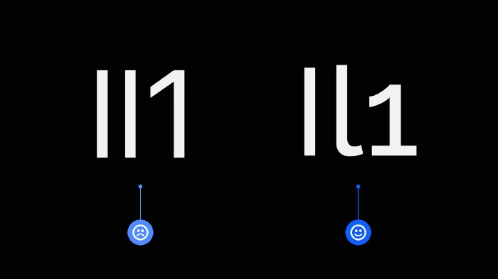
With this test, you compare three letters from the same Typeface: Uppercase i (I), Lowercase L (l), and the number one (1).
How different the letterforms look against one another can help determine readability, especially when working with Sans Serif Typefaces.