A research study, “Filled-in vs. Outline Icons: The Impact of Icon Style on Usability,” discovered that icon style affects task performance. Task performance was measured by the speed and accuracy of recognizing and selecting icons.
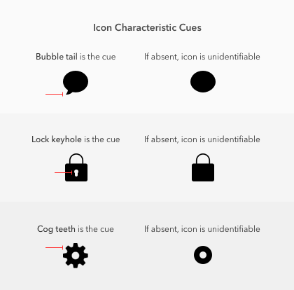
Characteristic Cues
Characteristic cues are what users use to identify icons. If characteristic cues are absent or hard to notice, the icon becomes unidentifiable.
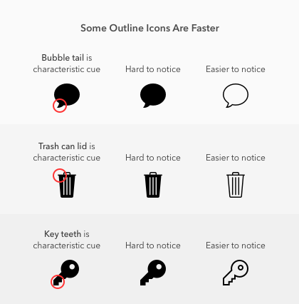
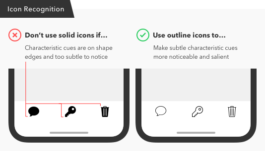
When Outline Icons Are Faster
In addition to including characteristic cues, the cues must be salient or easy to notice. Sometimes the characteristic cues on certain icons are more salient in an outline style than solid style.
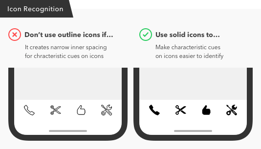
When Solid Icons Are Faster
The study found that the thumb, scissors, phone, and tools icon were faster to recognize in a solid style. This is because the outline style of these icons all have narrow inner spacing on their cues that create visual noise.
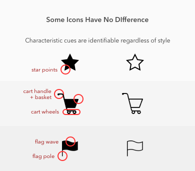
When Style Makes No Difference
The study found icons that were easy to recognize in either style. For example, the star, shopping cart, and flag icon all had similar recognition times.
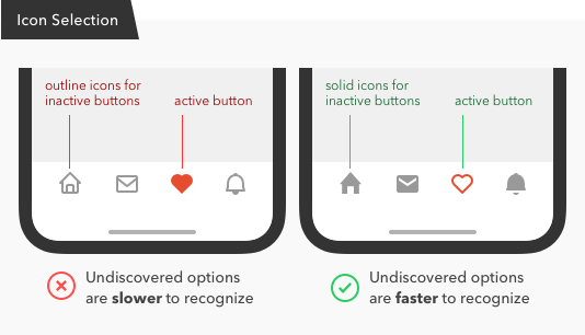
Icon Style for Button Selection
It’s common practice to use a solid icon to highlight the active button in a tab bar, while the other buttons remain in outline form. But this design practice is backward and should be the other way around.
Iconoclastic Guidelines
If task speed is important to your users, the icon recognition rate must be considered. And if you want a faster recognition rate, solid style icons are better. But there’s an exception to this rule that you should keep in mind. Knowing the exception to the rule allows you to make use of outline styles when the situation fits.
In summary, here’s what you should keep in mind when using icon styles:
- Icons consist of characteristic cues that need to be identifiable and salient
- Solid icons are faster to recognize unless their cues are subtle and not salient enough
- Outline icons are more recognizable when they have wide inner spacing
- Use outline icons if the solid version has subtle characteristic cues on the edges
- Use solid icons if the outline version creates narrow inner spacing