Optimizing call-to-action buttons for all users
Inaccessible Text Labels
Brand-colored buttons often have inaccessible text labels. Many brand colors are chosen without any consideration to accessibility. Instead, they’re chosen based on what looks most appealing on a logo. When that same brand color is applied to buttons, the text labels become difficult for visually impaired users to read.
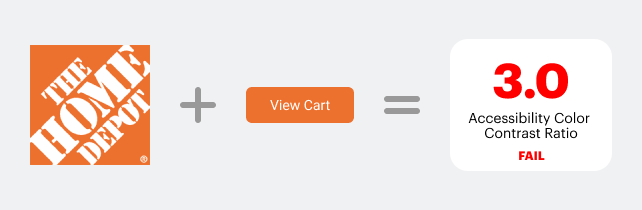
If a brand’s primary color is orange, making call-to-action buttons orange would render the label inaccessible. For example, applying Home Depot’s orange to a button would give it a color contrast ratio of 3.0. The ratio for optimal accessibility is 4.5. This button color would cause issues for visually impaired users.
Button State Conflicts
Red is a special color on buttons because it’s used to signify a warning state. Buttons that have destructive actions for deleting data are red to warn users of potential danger.
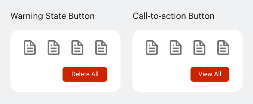
If your brand color is red, making your buttons the same color could conflict with any destructive actions on the interface. Users could click a dangerous action under the impression that it’s a regular action and delete data accidentally.
Conversely, regular actions that are red could cause concern. Users might hesitate to click a red call-to-action button if they’ve already experienced a destructive action.
Lower Clickthrough Rate
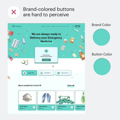
The chances are that buttons aren’t the only element on your interface that use your brand color. If any other elements on the screen also use the brand color, users will scroll past your buttons.
When you use your brand color everywhere, your buttons will have low contrast and fail to grab attention. Using a higher contrast color would help users find the buttons quicker and easier because the other elements aren’t competing.
If your buttons use any color other than blue, it isn’t getting as high of a clickthrough rate as possible. There are many reasons why blue buttons get the highest clickthrough rate.
For one, it’s the color that users are most familiar with for click interactions. Blue has been the color for links since the web’s inception. When users see a blue button, they’re more inclined to click.
Not only that, but blue is also associated with trust and dependability (source). Clicking a button requires users to trust that it’ll take them to where they expect. Blue buttons can utilize color psychology to improve clickthrough rate.
Blue buttons are also the most accessible to colorblind users (source). The most common form of colorblindness is red-green. Users with this color blindness cannot perceive green, red, orange, pink, or purple correctly. However, they still perceive blue as a shade of blue.
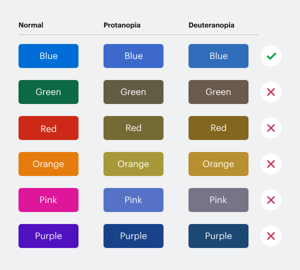
Here’s what users with protanopia and deuteranopia perceive when they look at different colored buttons. Notice how the blue button maintains a shade of blue while the other colors change.
Shades of Blue for Your Brand
If you want your buttons to be accessible with an optimal clickthrough rate, make them blue. There are different shades of blue you can choose from to complement your brand color.
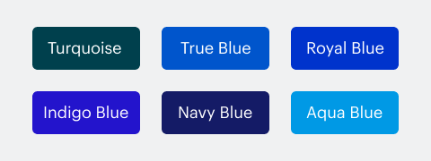
The shades that work best on a light background are true blue, royal blue, indigo blue, navy blue, and turquoise blue. Lighter shades of blue such as aqua blue work better on dark backgrounds.
No matter your brand color, you should always include a shade of blue in your color palette for buttons. There are other ways to integrate your brand color with the interface. Apply it to the elements that need highlighting, such as icons, active states, title text, illustrations, and badges.
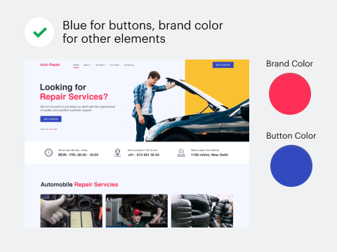
The Myth of Brand-Colored Buttons
Many designers believe that brand-colored buttons are necessary for aesthetics. The truth is you do not have to use your brand color on your buttons to make your interface appealing. Using a different color on your buttons won’t hurt your brand image or aesthetics, but it will hurt the user experience.
It’s okay to use your brand color for other interface elements, but call-to-action buttons are sacred. They’re the one element that needs a high level of clarity, accessibility, and interaction. Using brand-colored buttons is risky and suboptimal. Next time you’re designing buttons, think about the user experience before you think about branding.