There is a significant difference in the level of usability among the three designs.
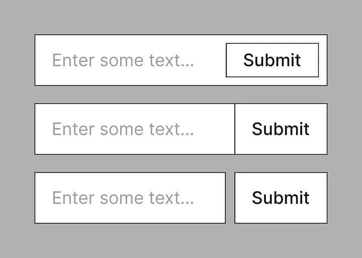
- Button inside the input
- Button touching input
- Button next to the input with space between
Start by asking these 3 questions:
Question #1: Does research show this pattern solves a problem?
This question gets to the heart of the matter.
Most fancy patterns have come directly out of the designer’s head. They aren’t born out of using boringly simple patterns and watching users struggle with them.
Designers love being different often at the cost of UX itself (which is ironic).
Question #2: Are there any potential usability issues with this pattern?
This question helps to evaluate the specific solution.
Does the thing look like what it is? Is it unconventional? Does it work on small screens? Does it work well for keyboard users? Etc.
This gives rationale against a particular design.
Question #3: How much effort is it to build?
This question helps to prioritize the pattern against other work.
If the pattern takes a lot of effort or more effort than it should, then that’s a good reason to deprioritize it.
Option 1 (a button inside input) is contentious because it’s not clear where the input starts and ends. The focus outline of the input should be around the input, not the input and button. It’s also more effort to build.
Option 2 (button touching input) is fine as long as the button is clearly distinguishable from the input (by using different a color perhaps).
Option 3 (button next to the input with space between) is best and clearly distinguishes the separate elements that do different things.