There are many questions about how to use the color orange with CTA buttons. When I worked at Eco/Gazelle, our brand color was orange, and we dealt with orange every day.
Can you guess which one is accessible

Colorable, calculates the contrast ratio between colors and ensures they meet Web Content Accessibility Guidelines (WCAG), an established range of recommendations for making web content more accessible. AA compliance, the most common, requires a minimum contrast ratio of 4.5 or 3 for large text, while AAA compliance, the more stringent or rare, requires a minimum contrast ratio of 7 or 4.5 for large text. Large text for AA and AAA is 18.66px minimum.

The white color seemed much clearer to me, but it didn’t meet the AA accessibility standards for my 14px button text. I couldn’t change the background color because orange was a branded color used in app and websites. Using any other color would make it feel disconnected. Although white stood out more, technically, black was the more accessible alternative, but it also felt like Halloween. I would lose that modern, non-digital connection.
Squint Test
I initially used the squint test because it was the simplest and quickest way to determine if this issue was worth investigating. It’s a commonly used technique that can be employed by anyone. By squinting, you can easily identify which elements stand out on the page, such as the prominence of CTAs in this case. Squinting serves as a natural contrast checker, but it lacks scientific backing. It wouldn’t meet accessibility standards in a formal setting.
Conclusion: The white text button appears to be the winner, but my testing was not based on any scientific evidence. I am not colorblind, so there are significant gaps in my understanding. Let’s consider asking colorblind users for further insight..
Color Blind Simulator
There are numerous tools available for calculating accessibility and simulating color blindness. While using these tools may take a little longer than the quick squint test, it is still easy and fast to use them for making accessible design decisions. I incorporated a couple of tools to enhance my research beyond just relying on the squint test.
Conclusion: I received conflicting results from different tools. When I used Stark to simulate a squint test for different types of color-blind users, the white text button appeared most clearly. However, Colorable indicated that the black text button was favored by a wide margin. To determine whether the issue was with the tools or some other variable, I needed to consider the human factor.
User Testing with Color Blind Participants
Since I am not colorblind, I needed to survey actual colorblind users. I asked three questions to a sample set of about 20 colorblind colleagues.
- What type of color blindness do you have?
- Which option is easier to read?
- Why?
Q1: What Type of Color Blindness Do You Have?
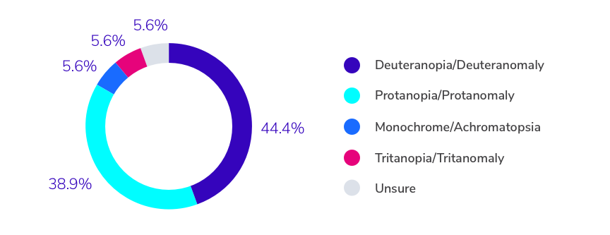
The majority of my users had deuteranopia or a deuteranomaly (no green cones or a limited number of green cones). This is the most common type of color blindness. The second most common type of color blindness is protanopia; deuteranopia and protanopia combined affect 8% of men and 0.5% of women. Since the data consistently reflects what is happening in the world, I felt like our colleagues were a good mix of subjects.
Q2: Which Option is Easier to Read?

Out of everyone surveyed, 61% of users preferred the white text button. Even color blind users thought the white text button was more legible. I was curious how the other 39% landed on the black text button, so I looked at answers one and two to see how different types of color blindness affected the second answer.

The results showed that there is a clear preference for certain text colors depending on the type of color blindness a person has. Among protanopia/protanomaly color-blind users, 71% favored white text, while users with deuteranopia/deuteranomaly were evenly split at 50/50. The only user with tritanopia/tritanomaly preferred white text, and the one user with monochrome/achromatopsia favored black text.
It’s important to remember that our color tools and mathematical analyses may not account for all user experiences, especially when it comes to color blindness. In design, it’s crucial to empathize with all users and ensure that the design journey meets both brand and user goals. However, it can be challenging because no matter what option we choose, it may override someone’s color blind preferences.
Q3: Why is That Option Easier to Read?
“Whatever colour this is (I don’t really know lol) this is easier for me to read with the white text.”
– Deuteranopia/Deuteranomaly, White Text Button
“Difference between the two is relatively small, but definitely more contrast between white and surrounding color than I see with the black text.”
– Protanopia/Protanomaly, White Text Button
“Black is more easily identifiable (and faster) — the white falls into the background.”
– Deuteranopia/Deuteranomaly, Black Text Button
“The black blends together with the orange.”
– Tritanopia/Tritanomaly, White Text Button
A few responses stood out — they talked about accessibility problems like buzzing on the screen, headaches, and white on dark text:
“I honestly don’t have trouble reading either of these but the white text just seems slightly easier on my eyes.”
– Protanopia/Protanomaly, White Text Button
“I can read the black text just fine, but it makes my head hurt to look at it for a long time.”
– Unsure, White Text Button
“Not sure. Neither one is difficult to read. The white text is slightly easier on my eyes. The black text with the orange background has a slight halo effect around it. The white is easier to track as I scroll.”
– Protanopia/Protanomaly, White Text Button
Conclusion: The data set of users preferred the white text button over the black text button, primarily because of contrast. But different types of color blindness produced different results. Specifically, the monochrome/achromatopsia user preferred black text. I also uncovered some interesting legibility concerns. Some users had unique issues reading the black text, saying it caused buzzing and headaches. Even though the black text is the accessible option by WCAG standards, it fails to account for this particular level of accessibility.
Since the math is what dictates how the law decides if a site is accessible, it is critical to design based on math. However, the math that I researched has lost me in their equations and standards of color contrast. I would like to believe that there is an outlier, especially in the color orange that causes these digits to be off. Further research is needed to help determine why the white text button was preferred. If you’re hoping for a clear answer on our orange black/white challenge, unfortunately, I don’t have a great resolution here.