The intuitive approach to working with colors is to gradually incorporate them as needed, step by step.

For example, if I need a grey shade for secondary text, I simply add it. In fact, the process of working with colors is quite similar across all interfaces, regardless of their differences. In each standard interface, we typically require the following colors: –
Black 🖤 for primary text and icons
Grey 🩶 for secondary text, icons, and strokes
An accent color 💙 for buttons and other clickable elements
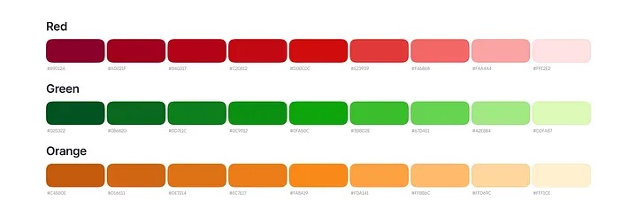
Red ❤️ for negative states, green 💚 for positive states, and orange 🧡 for warning states
White 🤍 for surfaces and elements against an accent or dark background
Additionally, we may use a few extra colors 🩵, 💜, 🩷, and 💛 for charts or badges.
Palette Creation
I typically begin with the accent color. Often it is a brand color that gives our interface a distinctive look. Most likely, we will need shades of this color. Let’s prepare them.

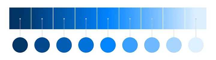
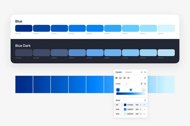
To ensure a smooth transition between shades and maintain consistency in tone, let’s use a gradient. It’s an excellent technique I picked up from my former colleague.
You don’t have to begin with #000000 and end with #ffffff in your gradients. Utilize colors that you intend to use in the interface.

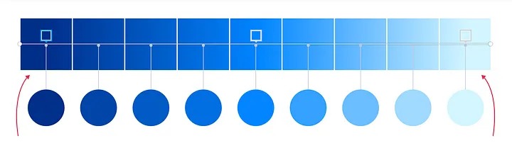
Divide the gradient into nine equal segments and adjust the gradient endpoints to the center of the first and last segments.

Select the central shade from each segment to create your initial palette.
Using shades of the same tone in your interface can sometimes make it look dull. To add vibrancy, consider warming up the lighter shades; this can enhance the overall appearance.

Don’t hesitate to alter the shades of the endpoints in your gradient if you want to create a more varied palette. In this example, I’ve made the dark color more purple and the light color more green.
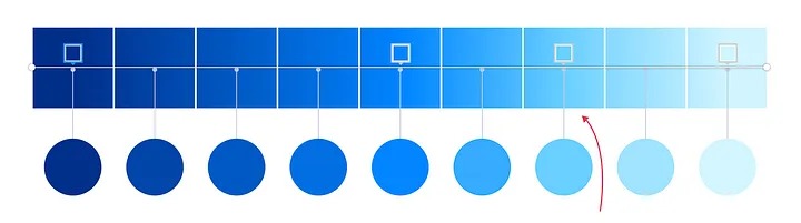
You might notice that some colors may not look quite right. By adding extra points to the gradient and adjusting the brightness, you can maintain an accurate palette while ensuring all the colors look flawless!
Creating More Palettes
Once you are satisfied with your accent color, use the same technique to create palettes for red, green, and orange colors.
Keep in mind that orange can become muddy if you darken it with black. Instead, add a touch of red to achieve a darker shade of orange.