Let’s clarify a common misconception: football fans are often perceived as aggressive. When Amsterdam constructed its new stadium, the authorities made the decision to design the seats in rainbow colors, believing that a vibrant environment would help reduce hooliganism.
However, this decision led to widespread frustration among fans. The local club, Ajax, is known for its red and white jerseys. Red is often associated with aggression, and many football clubs have adopted it as their primary color. As a result, the rainbow-colored stadium was not well-received, even in Amsterdam, which is recognized as one of the gay capitals of the world.
Two decades later, when the stadium seats needed to be replaced, the club announced plans for green seats. I happened to be at the stadium when the news broke, and the fans were outraged.
“Green is not Ajax’s color! It’s the color of FC Groningen. Who on earth made the decision to choose green seats?”
Clearly, Ajax was not focused on the color green for aesthetic reasons; they intended to highlight that the new seats would be made from sustainable materials. However, for football fans, “green” is associated with clubs that wear green shirts, rather than with environmentalism.
Rainbows have a calming effect on people, while red jerseys can signify aggression, and green often represents sustainability. This is how we might perceive these colors.
This anecdote about football illustrates how colors can be used in various contexts. Colors are not merely about hue and saturation; they also carry significant meanings. Each color can embody different emotions and associations depending on the culture.
In this article, I will explore how color influences our lives and impacts digital product design. I will provide seven examples that demonstrate how colors are interpreted differently across cultures.
Our brain — Important objects have warm colours
First, we need to discuss human similarities. Despite our cultural differences, we are obviously all people, with a comparable neurological system.
We are designed to endure in the wild, and our eyesight is **Our Brain: The Importance of Warm Colors**
First, we need to discuss human similarities. Despite our cultural differences, we are all humans with comparable neurological systems.
We are designed to survive in the wild, and our eyesight is optimized for our survival needs. When we lived in nature, it was essential to identify threats and opportunities quickly. We hunted for food to feed ourselves and our children.
It’s not a coincidence that important objects often have warm colors. For example, ripe fruits, burning fires, and insects frequently appear in shades of red, orange, or yellow. In contrast, plants, grass, water, and the sky tend to display cooler colors, such as green and blue.
Our retinas have sensors called cones that help us perceive these colors. We have three types of cones: one for blue (short wavelengths), one for green (medium), and one for red (long). Notably, we have more cones that detect red than those for blue or green. This design enables us to notice warm colors more effectively, which explains why notification bubbles on our phones are often red.
Biology scientists at MIT studied the vocabulary of color across various cultures to understand how different groups describe colors. They primarily investigated differences among three groups: the hunter-gatherer Tsimane people of the Amazon, Spanish-speaking individuals in Bolivia, and students in Boston.optimised for our survival needs.
When we lived in nature, we needed to identify threats and opportunities immediately. We hunted for food to feed ourselves and our children.
It’s not a coincidence that essential objects are often warm-coloured. Ripe fruits, burning fires, or insects, are frequently red, orange, or yellow.
Plants, grass, water, and the sky are cold colours: green and blue.
Our retina has sensors (cones) that help us see these colours. We use three cone types: one for blue (short wavelengths), one for green (medium), and one for red (long).
Our eyes have more cones that detect red than blue or green. We are designed to catch warm colours better. Why do you think the notification bubbles on our phones are shown in red?
Biology scientists at MIT studied the vocabulary of colour of various peoples. They wanted to understand if cultures have a similar way of describing colours.
They mainly investigated the differences between three groups: the hunter-gatherer Tsimane people of the Amazon, Spanish-speaking people in Bolivia, and students in Boston.
The researchers concluded that
Across languages … warm colors are communicated more efficiently than cool colors. This cross-linguistic pattern reflects the color statistics of the world: Objects (what we talk about) are typically warm-colored, and backgrounds are cool-colored.
As a result, in every culture, we are more effective at communicating warm hues, and this phenomenon is universal across the globe. However, it raises the question: what about our differences?
Is red positive or negative?
Red plays a crucial role in our survival, often representing both danger and vitality. It can be seen in various contexts, such as a forest fire, ripe apples, strawberries, or poisonous snakes and frogs. As the warmest color, red can also be quite polarizing. In Western cultures, red is typically associated with negative connotations. For example, a downward trend or a stop sign is represented by red. In the stock market, a decline is indicated by red, while an increase is shown in green. In contrast, in China, red symbolizes opportunity. Upward trends and positive movements, such as elevators going up, are represented by red.
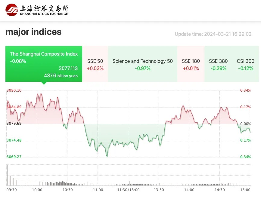
A quick glance at various financial websites reveals a preference for different colors to represent market trends. For instance, American site Yahoo displays positive numbers in green, while the Shanghai Stock Exchange uses red to signify upward trends.
An article in the Journal of Behavioral Decision Making explored this phenomenon in greater detail. The researchers examined not only financial markets but also various other societal aspects.
Mainland China television programs customarily use red up arrows to describe increasing numbers and green down arrows to describe decreasing numbers. Hong Kong television programs, however, use the opposite.
During the study, participants were shown a business proposal presentation.
Mainland Chinese individuals predicted greater consumption growth when information was presented in red compared to when it was displayed in green. In contrast, Hong Kong Chinese individuals anticipated the opposite trend.
This difference between the perceptions of people from China and Hong Kong can be attributed to the influence of Western culture in Hong Kong, which has become much more Westernized than mainland China.
In Western cultures, red is often associated with alerts and warnings. Phrases like “caught red-handed,” “seeing red,” and having a “bank balance in the red,” illustrate this connection. Additionally, people may encounter “red tape” in bureaucratic processes, and job candidates may exhibit “red flags” or use “red herrings.”
Conversely, red also symbolizes sensuality and romance. Hearts are commonly depicted in red, and the color is frequently used in the sex industry and nightclubs. Some of us even walk on red carpets during special events.
In contrast, in many Asian cultures, red is linked to good luck, prosperity, and happiness. It is prominently featured in traditional celebrations and festivals, such as Chinese New Year and weddings.

Certain colors were priced higher than others.
A great way to understand how specific colors acquired their meanings is by exploring the historical production of paint.
Purple paint was expensive to produce, which contributed to its association with high value. In ancient Greece, purple was considered the color of the gods. In the Bible, heaven is described as being adorned in purple and gold. During the Roman Empire, officials wore purple, and Catholic cardinals donned purple robes.
The phrase “born to the purple” originates from the Byzantine Empire, referring to royal children born in the palace’s purple room, where infants were wrapped in purple fabric. Today, we use the expression “born to the purple” to describe someone born into a life of privilege.
In China, yellow is also regarded as an exclusive color due to its rarity. The Emperor of China’s robe was traditionally saffron yellow.
Today we can artificially make dye and paint that give purple colour and “imperial yellow” at relatively low costs. In ancient times, however, 1200 purple shells were needed to produce 1.4 grams of real purple and 15,000 stigmas from saffron crocus were needed to produce 0.5 kilograms of saffron yellow.
Source
Thus, the more difficult it was to obtain shells of a specific color, the more exclusive that color was considered.

What is the color of spirituality?
In Western culture, people often associate meditation with a natural state of being. They find peace and tranquility in the light blue sky or in the water. This connection between light blue and serenity also influences app design.
Considering the large number of Western meditation, yoga, and mindfulness apps, it seems reasonable to conclude that blue is often seen as the color of spirituality.
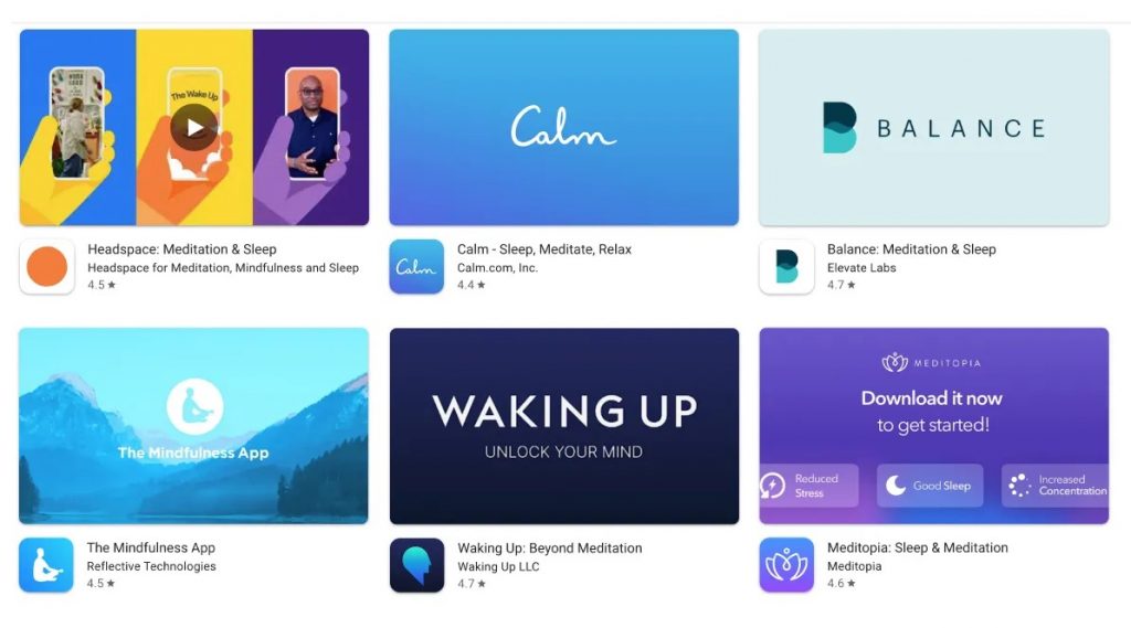
However, the popular app Headspace uses orange in its branding, which can be explained. An article from the University of the West of Scotland discusses this.
In Asia orange is a positive, spiritually enlightened, and life-affirming Color
Simply looking at the temples in Asia clearly shows how orange and spirituality are linked.
The Scottish scientists further mention something interesting.
The Shona language in Zimbabwe and the Boas language in Liberia do not have words that distinguish between red and orange. This linguistic limitation affects people’s ability to perceive different colors.
This indicates that our understanding of color—and the world in general—is connected to our vocabulary. Without a word for something, we attribute a different meaning in our mental framework.
How much color is too much?
The same Scottish article continues to reveal something significant when the linguistics of color are further investigated.
Those who live in climates with a lot of sunlight prefer warm bright colours; while those from climates with less sunlight prefer cooler, less saturated colours. — Eskimos use 17 words for white as applied to different snow conditions.
The differences in architecture and fashion between two geographical opposites are quite apparent. In the French city of Nice, the houses are painted in a variety of colors, and the streets are lively. In contrast, in Amsterdam, all the houses are built with similar bricks.
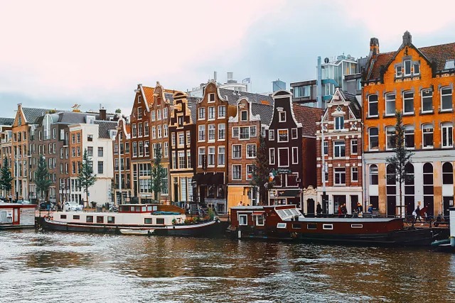
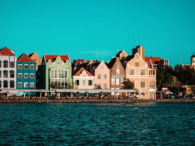
A comparison between the Dutch city of Amsterdam and the former Dutch colony of Curaçao reveals that their architecture is similar; however, the buildings in Willemstad are much more colorful. By analyzing governmental websites, we can illustrate the differences in color preferences between the two locations.

The image above presents the homepages of the governments of various African countries in the top four screenshots. These websites feature a vibrant array of colors, which reflects the colorful essence of African life. This preference for vivid aesthetics is also evident in fashion and digital design, as people in Africa tend to wear much more colorful clothing.
In contrast, the bottom four websites showcase government homepages from European countries. These sites adopt a minimalistic design that primarily uses shades of blue, a more neutral color. Overall, the aesthetic of European and North American designs is notably more minimal than that of African designs.
Can color choices influence product quality?
Jean-Charles Chebat and Maureen Morrin published some intriguing findings in the Journal of Business Research. The researchers examined how consumers reacted to the decoration of shopping malls. They discovered that while color did not significantly affect pleasure and arousal levels, the overall decoration did influence how visitors perceived the mall environment. This experience subsequently shaped their perception of product quality.
Interestingly, the study also highlighted cultural differences. French Canadians responded more positively to warm-colored decorations, while Anglo-Canadians preferred cooler environments.
In conclusion, the study suggests that color choices in decoration can affect consumers’ perceptions of product quality through their overall shopping experience.
French Canadians had higher perceptions of product quality when the mall exhibited a warm colour décor. In contrast, Anglo-Canadians had higher perceptions of product quality when the mall exhibited a cool color décor.¨
How can we make our brand more reliable?
English-speaking Canadians found that the products were of higher quality when the mall was decorated in cool colors. Blue is the most notable cool color and is commonly associated with quality and reliability.
Many banks incorporate blue into their branding, and numerous social media platforms also choose blue to convey a sense of data privacy—whether or not this is entirely true. Apps such as Signal, Discord, and Telegram utilize blue in their designs, as do LinkedIn, Skype, and Zoom, which aim to present themselves as professional and trustworthy.
Additionally, Virtual Private Networks (VPNs) and other digital security apps often choose a blue-toned branding to reinforce their reliability.

The term “blue-blooded” is used in all languages to describe aristocracy. While it’s unclear how closely monarchy is tied to reliability, the term certainly conveys a sense of nobility.
In English, “playing the blues” and “feeling blue” refer to feelings of sadness and nostalgia, but this meaning does not translate directly into other languages. For example, in German, “blau sein” (to be blue) means to be drunk. Lithuanians use the word “žydras,” and Russians use “голубой” (light blue) to refer to homosexuals in an offensive manner, although the Kremlin seems to be attempting to suppress this word.
In the West, the term “blue-collar worker” describes someone who performs manual labor, typically in fields such as manufacturing, construction, and maintenance.
Black and white
White-collar workers, and we can also include white-collar criminals in this category, are individuals who conduct their work or engage in illicit activities from behind a desk. Often, they might engage in practices to conceal their illegal earnings.
The color white is often associated with purity—think of the white tablecloths seen in restaurants. Interestingly, in China, white is a color of mourning.
White can also symbolize peace; for example, doves are commonly depicted as white, and we use white flags to signify surrender.
Trust is often represented through whitelists, while something deemed harmful may be placed on a blacklist. We refer to a “black page” in history to denote dark events, and those who do not fit in are often labeled as black sheep. Pirates are famously associated with black flags.
This pattern highlights a linguistic bias where white is often linked to positive qualities while black is associated with negative connotations.
The color black tends to evoke fear across different age groups. For instance, police officers in black uniforms are typically perceived more negatively than those in blue, and sports teams wearing black jerseys are often viewed as more intimidating.
Do politics and religion have a color?
In Europe, the color red is commonly associated with the Labour Party, often paired with the image of a rose. Additionally, red can symbolize communism or refer to “the People’s Party.”
Green is a fitting color for parties that prioritize environmentalism, as it represents nature. In the UK and the Netherlands, people may describe themselves as living a green lifestyle or having “green fingers,” while in Germany, the term is “green hands,” and in Italy, it’s “green thumb.”
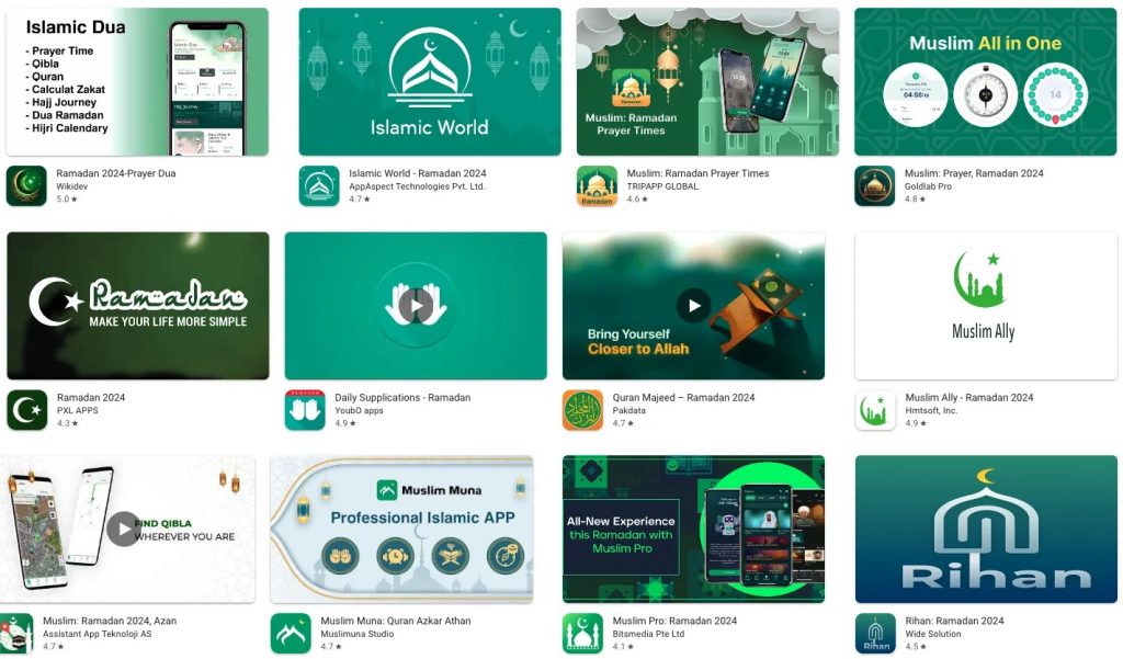
However, green should be used carefully in Muslim countries. For Muslims, the color green holds sacred significance. A quick search in the app store illustrates this: many Islamic prayer apps are branded in green.
The Conclusion
We are naturally designed to notice red objects quickly. Does this indicate a threat or an opportunity? It depends.
Should we use warm or cool colors in a shop to enhance the perception of a product’s quality? It depends.
What color do you associate with spirituality—orange or blue? It depends.
Purple and yellow became symbols of wealth due to their difficulty in production. Green is often associated with Islam or environmentalism, while red is linked to socialism.
Colors are more than mere aesthetics. Our perception of color is influenced by our climate and is even shaped by the rarity of certain colors in nature, such as shells.
When designing your brands or user interfaces, you cannot simply choose random colors that look appealing. You cannot assume that a green “add to shopping cart” button will lead to increased sales, nor can you take for granted that red error messages are perceived as encouragement to improve form inputs.
I often reach the same conclusion in my articles, which sometimes makes me feel like a broken record. However, if you want to serve a global market or any audience outside your immediate bubble, it is essential to understand the people you want to reach.
You need to test your product with its specific target audience. I would even argue for assembling a genuinely multicultural design team to create a high-quality, multicultural product.
Testing your app with a seemingly diverse group of users in your local area does not guarantee true diversity. It only reflects diversity within your own bubble.
I must admit that writing this article required a lot of mental effort. The world has many cultural subtleties, and identifying these differences is not easy. Each continent, country, and culture has its own unique way of interpreting color, often influenced by its history, climate, and the exclusivity of available shells, paints, and other materials.
Coming from a colder climate, I sometimes feel a bit envious when observing warmer cultures. They tend to be much more colorful, but then again, the grass is always greener on the other side.