I worked on a project that had a poor UI color scheme and lacked a design system. To address these issues, I conducted research and developed a color palette that could be easily applied to the UI while ensuring accessibility. Here is the process I followed to create a basic color palette for the interface:
- Understand color accessibility guidelines (WCAG).
- Develop a range of neutral gray shades.
- Create a hue palette using the brand colors.
- Apply the gray shades across all color families.
- Refine the colors and check for contrast.
Step 1: Understand Color Accessibility (WCAG)
The Web Content Accessibility Guidelines (WCAG) ensure that digital content is accessible to users with visual impairments, including color blindness. These guidelines enhance overall usability and inclusivity for all users and are widely adopted across the industry.
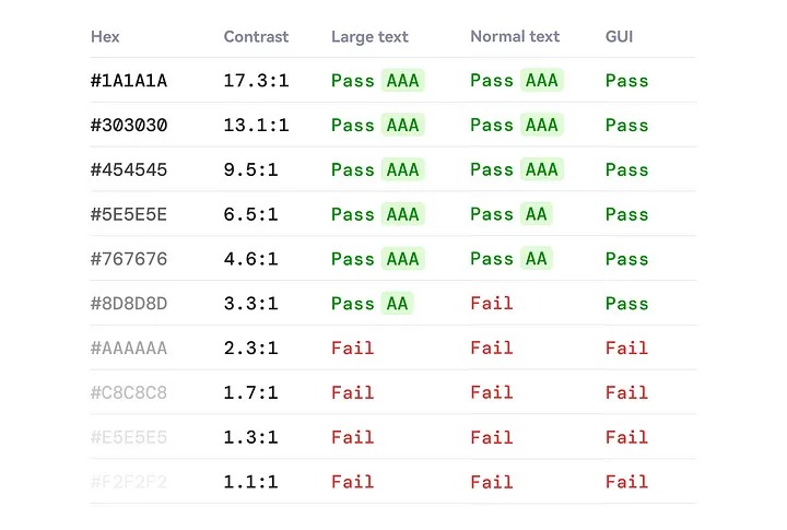
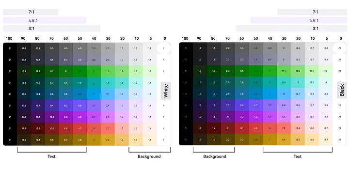
Text Minimum Contrast (AA)
- Normal text must have a contrast ratio of at least 4.5:1.
- Large text must have a contrast ratio of at least 3:1.
Text Enhanced Contrast (AAA)
- Normal text must have a contrast ratio of at least 7:1.
- Large text must have a contrast ratio of at least 4.5:1.
Graphical User Interface (GUI)
User interface components and graphical elements should have a contrast ratio of at least 3:1.
Step 2: Develop Neutral Gray Steps
I created a range of neutral grays to be used flexibly throughout the user interface, adhering to a specific color step selection principle:
- More Light Steps, Fewer Dark Steps: Because darker shades tend to blend together, I included more lighter shades. Lighter colors are easier to distinguish from one another.

- Fewer Mid-Tone Steps: An excess of mid-tone shades can make the user interface appear muddy. By using fewer mid-tone steps, we can achieve a cleaner and more defined look.
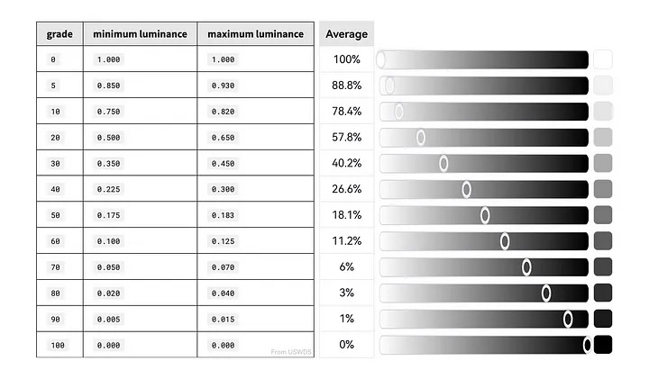
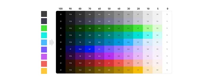
I was looking for a quicker way to create color steps when I found an article from USWDS. They introduced a method that utilizes “magic numbers” and color steps based on luminance ranges. For instance, blue-40 and gray-90 (with a difference of 50) achieve a contrast ratio of 4.5:1.
Here are the definitions of the magic numbers:
- A magic number of 40 or more ensures a contrast ratio of at least 3:1.
- A magic number of 50 or more ensures a contrast ratio of at least 4.5:1.
- A magic number of 70 or more ensures a contrast ratio of at least 7:1.
I started by using the average luminance of each step to simplify the process, allowing for adjustments during testing.
Step 3: Create a Hue Palette Using Brand Colors
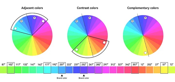
I utilized the HSB color space to create the hue palette. The product’s primary brand color is HSB 252° (Hue), 71% (Saturation), and 100% (Brightness); therefore, I set the hue starting at 252° and applied increments and decrements of 15° to develop a 24-color palette. This palette serves as a key reference for selecting supportive colors.
Since the brand color features a gradient, I selected two base colors to identify supportive options:
- Adjacent Colors: Colors that are 15° apart on the color wheel are considered adjacent, creating a harmonious relationship within a 60° range. These colors blend smoothly together.
- Contrast Colors: Colors that differ by 120° to 180° on the color wheel are classified as contrast colors. In this process, I specifically used a 120° angle to determine these contrast colors.
- Complementary Colors: Colors positioned 180° apart on the color wheel are referred to as complementary colors. When placed next to each other, they create the strongest contrast, enhancing visual impact.
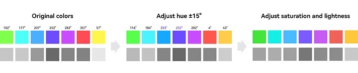
Next, I adjusted the hue within a 15° range while maintaining brightness and relevance to the context (e.g., green for success, blue for information). I kept purple at 252° and blue at 203° to ensure brand consistency. Then, I fine-tuned the saturation and lightness to ensure they aligned closely across the palette.
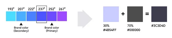
I also expanded the gray hues by incorporating the brand colors. I chose a hue at 237° (#4B54FF) for blending, as it connects the primary and secondary colors. By mixing 30% of #4B54FF with 70% of #000000, I created a new gray (#3C3D4D) infused with brand tones. This modified gray feels more unique and vibrant, seamlessly integrating with the other brand colors.
Step 4: Apply Gray Steps Across All Color Families
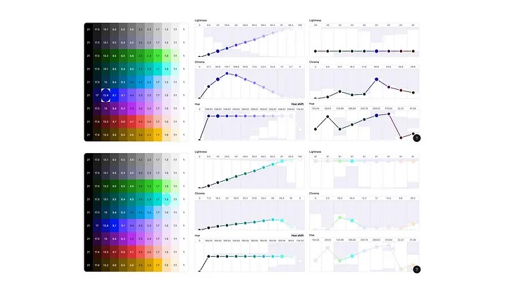
I applied consistent gray steps across all color families using the Atmos tool. This tool utilizes perceptually uniform color spaces (LCH), which are designed to model human vision. It ensures that color transformations accurately reflect our perception of color, maintaining uniform lightness and saturation across all shades. Additionally, it makes adjusting colors and checking contrast much easier.
Step 5: Refine colors and check contrast
I continuously refine and evaluate the colors to ensure consistent saturation and visual weight at each level, preventing any single color from dominating. Then, I check the contrast and define the use cases.
I tested the colors in the user interface, and they worked effectively—the content feels much clearer and more personalized than before. However, some colors may still require fine-tuning based on your specific use cases and design style. You can also add more steps to the system to better accommodate your needs.