These are a few of the most common behaviors that people demonstrate as they relate to product design. A product that supports these patterns will assist our users in achieving their goals effectively and quickly.
When designing any product, it’s essential that we do so based on an understanding of how users will expect them to function. If we build our product in a vacuum without considering the existing products in the market or the psychology and culture of our users, then it’s sure to leave them confused and frustrated.
1. Safe Exploration
“Let me explore without getting lost or getting into trouble.”
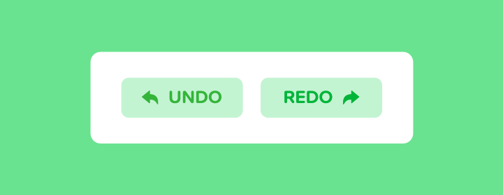
“When someone feels like they can explore an interface and not suffer dire consequences, they’re likely to learn more — and feel more positive about it — than someone who doesn’t explore. Good software allows people to try something unfamiliar, back out, and try something else, all without stress.”
Unlike in the real world, interfaces make it easy for users to mend their mistakes. If you’re at the office and spill coffee on your skirt, then you’re kind of screwed — you can’t CTRL + Z that. Our interface designs, in contrast, should encourage users to explore the different options available and then allow them to get back where they started or undo any actions easily.
Examples:
- Back buttons making it easy to get back where I started
- Trying photo filters but making it easy to undo if I don’t like the result
- Saving history
- Undo buttons for documents
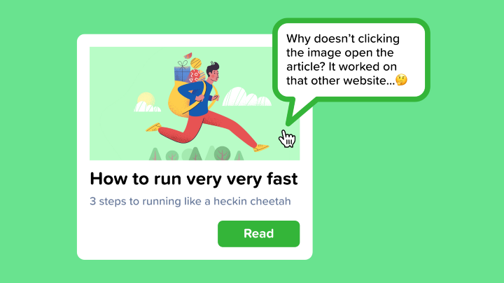
2. Instant Gratification
“I want to accomplish something now, not later.”
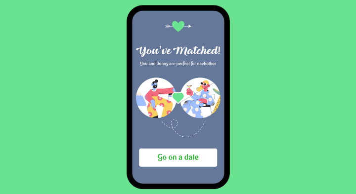
“People like to see immediate results from the actions they take — it’s human nature. If someone starts using an application and gets a “success experience” within the first few seconds, that’s gratifying! They’ll be more likely to keep using it, even if it becomes more difficult later. They will feel more confident in the application, and more confident in themselves, than if they had taken a while to figure things out.”
In our fast-moving digital world, everything is getting that much quicker and easier. Hungry? A door dasher can be at your place in 30 mins or less. Need a ride? Uber is minutes away. Want a date? You could be matched with a potential date in a matter of seconds on dating apps. The list goes on…
If our product isn’t providing an instant hit of dopamine, then it’s at risk of being disrupted by a competitor’s product that is. Consider in your design how you can give your users a feeling of satisfaction or achievement in the experience.
Examples:
- Getting a match on a dating app
- A blast of Confetti when you complete a habit
- Calling an Uber and immediately having one on the way
- Hitting the snooze button
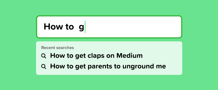
3. Satisficing
“This is good enough. don’t want to spend more time learning to do it better.”
“When people look at a new interface, they don’t read every piece of it methodically and decide, Hmm, I think this button has the best chance of getting me what I want. Instead, a user will rapidly scan the interface, pick whatever they see first that might get them what they want, and try it — even if it might be wrong.”
“People are willing to accept “good enough” instead of “best” if learning all the alternatives might cost time or effort.”
Ever quickly scan a landing page without reading beyond the header text and then deciding it’s not for you? Me too — all the time. We’re subconsciously and consciously absorbing and assessing whether the product can solve our problem, make our life better, or if it meets our standards.
Make the most important information simple for your user to grasp at a glance. If you’re relying on your users to read large blocks of text to understand how your product can benefit them, then you’re allowing the majority of potential users to fall through the cracks.
Key points:
- Make obvious options that are safe for the user to select
- An interface should be easily scannable
- Users will look for the first option that might work
4. Deferred Choices
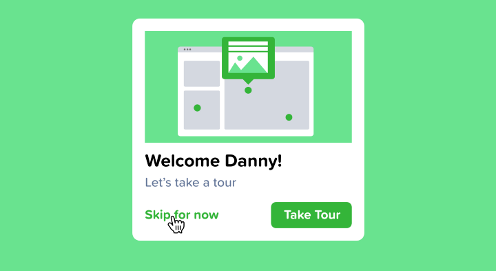
“I don’t want to answer that now; just let me finish!”
“This follows from people’s desire for instant gratification. If you ask a task-focused user unnecessary questions in the process, they might prefer to skip the questions and come back to them later. For example, some web-based bulletin boards have long and complicated procedures for registering users. Screen names, email addresses, privacy preferences, avatars, self-descriptions… the list goes on and on. “But I just wanted to post one little thing,” says the user.
“Why not allow them to skip most of the question, answer the bare minimum, and come back later (if ever) to fill in the rest? Otherwise, they might be there for half an hour answering essay questions and finding the perfect avatar image.”
As UX designers, we should be considering where we can slim the fat wherever necessary. Don’t ask for unnecessary information, but more importantly, allow information to be entered later or make it optional.
Anything that isn’t 100% necessary should be skippable.
Key points:
- Don’t have too many steps
- Allow users to ‘skip’
- Separate important questions from the ones that are less important
- Allow users to add, change, or edit things later
5. Habituation
“That gesture works everywhere else; why doesn’t it work here, too?”
“When you use an interface repeatedly, some frequent physical actions become reflexive: pressing Ctrl-S to save a document, clicking the Back button to leave a web page, pressing Return to close a modal dialog box, using gestures to show and hide windows — even pressing a car’s brake pedal. The user no longer needs to think consciously about these actions. They’ve become habitual.”
As someone who uses Figma, XD, and Sketch in tandem daily, I am impressed with how uniform most of the controls are but still get annoyed at the occasional difference.
If there is an industry-standard for interaction or UI, then it’s best to follow these conventions to be safe — redesigning existing patterns is generally more confusing than useful. Save your creativity for other aspects of the product.
Examples:
- CTRL + S, CTRL + Z
- Swiping left or right to go to the next or previous screen
- Pressing X to exit a dialog
- Swiping down to refresh on mobile
6. Spacial Memory
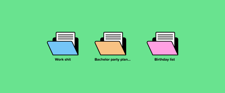
“I swear that button was here a minute ago. Where did it go?”
“When people manipulate objects and documents, they often find them again later by remembering where they are, not what they’re named.”
“Spacial memory explains why it’s good to provide user-arranged areas for sorting documents and objects, such as the aforementioned desktop. Such things aren’t always practical, especially with large numbers of objects, but it works quite well with small numbers. When people arrange things themselves, they’re likely to remember where they put them.”
Think about your application as though it’s a physical space. People will be arranging things in a way that they see fit, not how your algorithm thinks they should be. Make it easy for your users to re-arrange things and bookmark or save items for later.
Examples:
- Grouping apps into folders
- Snapchat placing different screens with a swipe left, right, up, or down
- Arranging programs on a desktop
- Sorting cards in Apple wallet
7. Social Proof
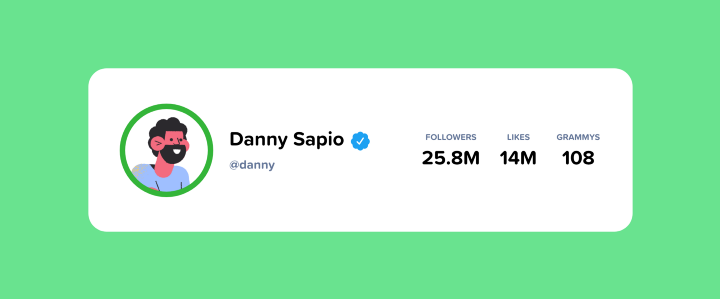
“What did everyone else say about this?”
“People are social. As strong as our opinions might sometimes be, we tend to be influenced by what our peers say or do. And we are powerfully attuned to seeking approval from others and belonging to a group. We maintain social media identities. We contribute to groups and people we care about.”
Social proof can make your product more compelling. It doesn’t necessarily need to include the user’s friends, though it can. Displaying items based on popularity will make your users feel less alone in their decision making. If others have chosen to do something and were pleased with their choice, then there’s a good chance that it’s a sensible option.
No one wants to join a deserted community — one of my favorite examples of this is Reddit. Reddit founders made hundreds of fake profiles to make the site look popular.
Examples:
- Reviews on Amazon, Airbnb, Yelp, etc.
- Likes, reactions, shares, retweets, followers, number of friends, a blue checkmark, comments, or views.
- Advice or recommended products from friends
- “48 of your friends like this page”
8. Streamlined Repetition
“I have to repeat this how many times?”
In many kinds of applications, users sometimes find themselves needing to perform the same operation over and over again. The easier it is for them, the better. If you can help reduce the operation down to one keystroke or click per repetition — or better, just a few keystrokes or clicks for all repetitions — you will spare users much tedium.”
I used to do a decent amount of customer service for my first company and found myself continually copying and pasting the same generic responses from a doc. I eventually said, to hell with this, there has to be a better way. There was — I found a chrome extension that used text shortcut to auto-fill what I was trying to say. If I typed “greet%,” it would auto paste my greeting message.
This saved me enormous amounts of time and helped me recognize the importance of streamlining user experiences for frequently repeated actions.
If your users are continuously repeating the same command or action — make a shortcut or workflow for it to make their life easier.
Examples:
- Autofill when you start typing something
- Google Chrome auto-completing the query “yo” with “www.youtube.com”
- Automating routine processes in Slack with workflow builder
- “Delete All” or “Select All”
9. Prospective Memory

“I’m putting this here to remind myself to deal with it later.”
“We arrange in prospective memory when we plan to do something in the future, and we arrange some way of reminding ourselves to do it. For example, if you need to bring a book to work the next day, the night before, you might put it on a table beside the front door. If you need to respond to someone’s email later, you might leave that email on your screen as a physical reminder.”
Prospective memory doesn’t appear too frequently in interfaces, but it’s an important pattern to recognize and design for. The infrastructure for prospective memory is what’s most important. Allowing users to save drafts, be reminded of something later, or placing un-finished tasks in an easy to find spot will assist the user when they return to the task.
Examples:
- Leaving windows open as a reminder that something needs to be completed
- Starring or marking an email as unread
- Bookmarking websites to view later
- Highlighting text in a document as a reminder to revise it later
10. Microbreaks

“I’m waiting for the train. Let me do something useful for two minutes.”
“People often find themselves with a few minutes of downtime. They might need a mental break while working; they might be in line at a store or sitting in a traffic jam. They might be bored or impatient. They want to do something constructive or entertaining to pass the time, knowing they won’t have enough time to get deep into an online activity.”
Your interface should encourage users to use it in the spare 2 minutes they have on the elevator. Making it easy to learn something quickly, be entertained, or find the information they need. This goes back to instant gratification — if a user is confident that your application will give them a quick moment of delight, then they’ll come back again and again.
Examples:
- Scrolling through Instagram
- Reading news
- Playing a game
- Responding to messages
- Checking email
- Swiping on Bumble