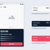
As human beings, we are prompted to set goals and then aim to achieve them. And when you perform a complex task, your brain releases large amounts of endorphins that trigger euphoria.
An example of this is the LinkedIn profile completion tracker. The goal is to complete the profile. As you know completing a Linkedin profile is not something to be done in a couple of minutes. So Linkedin breaks down the goal into smaller milestones so the user can complete the given milestones and come back to check their progress.
The Paradox of Choice in Information Architecture
Information architecture (IA) is a science of organizing and structuring the information of websites, mobile applications, social media platforms, etc. Richard Saul Wurman, who was an American graphic designer and architect, is considered to be a founder of the IA field. According to the IA experts, information architecture is important to UX designers because they must decide how to arrange the information of something in order for it to be understandable.
The goal of organizing content is so that users would easily adjust to the purpose of the product and could find everything they need without much effort. The content structure depends on various factors. First of all, IA experts study the details of the target audience’s needs because IA places user satisfaction as a priority. It also depends on the offers clients or companies have and on the type of product.
Have in mind that good information architecture is a foundation of efficient user experience. It includes a variety of aspects influencing users’ behavior and actions such as emotion and psychology.
So what’s the psychological connection here? Well, the first preferred task is to make sure that you offer information to the user slowly, in a way that people can digest easily. This is done in order to prevent your users from experiencing the paradox of choice first-hand.
The paradox of choice is a term coined by Barry Schwartz from his book “The Paradox Of Choice — Why More Is Less”. Schwartz was astonished to find through his research that people who have many options available to them don’t seem to be particularly happy and take too long to choose. For example, one of the research done pointed out that buyers could take a long time to make a decision when in a supermarket trying to decide between 50+ kinds of cereals available.
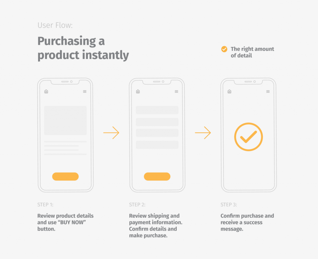
So, you want to create a path that users can follow so that they are confronted with a small number of choices. Even the most complicated product can break up decisions into smaller parts so that users can use the product in a way that feels natural and effortless.
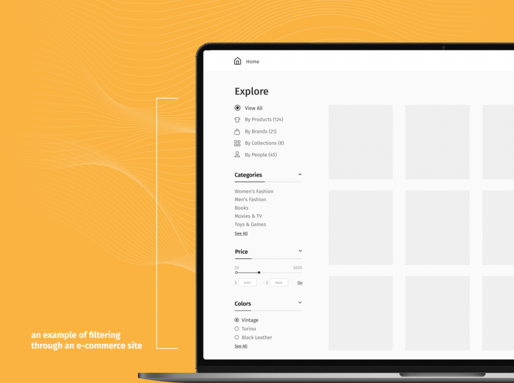
For example, say you are searching to buy a dress online. In order to not make the user search through 500+ different kinds of dresses available, most online shops give you the option to narrow your search by giving you categories to filter out like: evening dress, casual dress, size M dress, blue dress, etc.
Providing good information architecture to your product will make you consider navigation, labeling, organization, and search systems in your product. People will, most likely, filter out what kind of dress they want before beginning the search. And even though the number of alternatives will be reduced greatly, so will the user’s stress.