#1 — Hick’s law
Synonym: paradox of choice
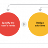
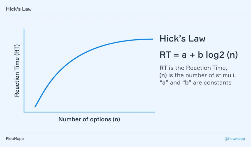
Hick’s law states that the time needed to make a decision depends on the amount of choices available to a person. The more choices exist, the more time we need.
This law is named after British and American psychologist William Edmund Hick. He and his colleague Ray Human studied the dependence between the number of stimuli and an individual’s reaction time to them. In 1952 they conducted a test.
That experiment involved 10 lamps that lightened randomly. Participants had to choose the one that lightened. The more lamps were there, the more time people needed to choose the right one.
How To Use It
1. Reduce the number of choices
When response time is critical to increase decision time. For example, this is important for control system environments and menus. Remember that the less options you give a user, the more likely he performs an action.
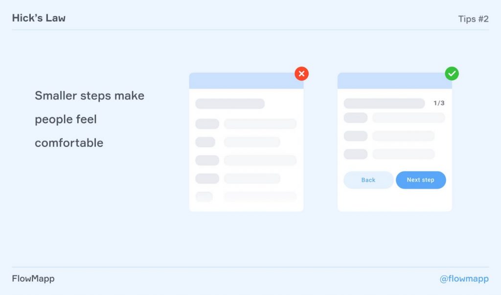
2. Break down complex and long processes into smaller steps
For example, you can divide the user registration process into several screens. It will make the interface more user friendly.
3. Keep a balance between reducing complexity and oversimplifying
Breaking down the choices for a series of lots of small chunks can make the user leave before reaching the goal.
There are two rules to make small steps work: show how many steps you have and try to limit them to 5 steps max.
4. Use the highlighting to help users to avoid overloading and to make a choice quicker
You can stand out important options for users among the cluttered interface.
5. Categorize choice to navigate users in a website
If one menu offers direct access to every link, it could quickly overload the user.
How To Break The Law
There are situations when infinite choice works great. For example, infinite scroll in Instagram or Tik Tok. At the same time, in both cases actions are so simple that users actually can repeat them a lot of times. It is different with Netflix, for instance. The reduсtion of options here works much better: people like different lists like Trending Now, Top-10 In Your Country, Best Comedies and so on. Such lists help users to make a hard decision — how to pick one film or TV show among thousands.
#2 — Law of Prägnanz
Synonyms: principles of grouping, the law of perceptual organization
Why Prägnanz
“Prägnanz” is a German word that means salience, conciseness, and orderliness.
The law of Prägnanz is the fundamental principle of the Gestalt laws of grouping. Gestalt laws are rules which describe how humans perceive visual elements and simplify complex images.
Gestalt psychologists argue that our mind has an innate disposition to perceive patterns using these five categories: proximity, similarity, continuity, closure, and connectedness.
Pretty much the same way you can apply this principle to UI. Users see your interface as a whole and this means two things.
- If you want to ease the user’s perception use simple forms and group them in obvious and expected way.
- If you want to highlight an element, well, break this rule, but try to avoid chaos. Breaking rules is effective only when it contrasts order.
#3 — Jakob’s Law
Jakob’s Law states that users spend most of their time on other sites. That’s why they prefer sites that work the same way as all the other sites.
For designers this means that it is always better to choose usual design solutions that are familiar to users.
Who is Jacob
Jakob Nielsen is a usability expert and co-founder of the Nielsen Norman Group — UX research and consulting company. In 2000 he described his observations on users’ behaviour. According to Nielsen, users’ feel confused and frustrated when they face uncommon patterns in design. In these cases they tend to abandon tasks and leave the site.
Tips & Tricks
- Use familiar UX patterns
Users should focus directly on products, services, offers and other content, instead of complex and creative innovations in UX. - Keep balance
Sites overloaded with creativity and non-standard elements confuse users. Try to limit the amount of unfamiliar elements. - Help users
Give them clues when it comes to non-obvious patterns. - Meet expectations
The user should feel complete control over your site. Let users’ expectations come true, and they will trust the site and probably come back again. - Do not deny users’ experience
Keep in mind the past user experience, focus on it and use it. It’s better than creating something new just because you want to be different.
#4 – Tesler’s Law
Synonym: the law of conservation of complexity
Tesler’s Law, also known as The law of conservation of complexity, states that for any system there is a certain level of complexity that cannot be reduced. According to the law, each application has a certain degree of complexity that either the developer or the user has to deal with.
History
Larry Tesler is a computer scientist who specializes in human-computer interaction. He has worked for companies such as Xerox PARC, Apple, Amazon, and Yahoo. Larry Tesler described the law in the mid-1980s. He argued that complexity does not disappear, but moves from one area to another. When you simplify the system for the user, you will inevitably transfer this complexity to the developers.
Tips & Tricks
- Remove the main burden on users at the stage of development and design of the system.
- Don’t oversimplify. It is impossible to make a product without a single complexity. But by simplifying the system, you make it more difficult to work on it. If you save 5% of the complexity of the application for the user, but add 50% of the complexity for its development, is it worth it?
- Balance the difficulty. Carefully decide how much to transfer complexity from users to developers and vice versa.
- Before you simplify the processes, analyze whether such a function is required at all.
#5 — First Parkinson’s Law
Parkinson’s Law states that the amount of time you give a task to take is equivalent to the amount of time that task will take. In other words, the work fills up the time allotted for it. For example, if you have a week to finish an article, the article will take all week to finish. Basically, the more time you have available to complete the task, the more time you will spend doing it.
History
In 1955, Cyril Parkinson, a British military historian, published a satirical article in the British magazine The Economist, in which he stated the empirical law: “Work expands to fill the time available for its completion”. In this article, he talked about how organizations have uncontrolled growth because of their self-serving nature: each department creates work for the other. The official wants to multiply subordinates, not rivals. Cyril Parkinson later promoted his idea in a book “Parkinson’s Law: The Pursuit of Progress”. Despite its satirical origins Parkinson’s statement is true today.
Tips & Tricks
- If the task takes a long time, try to do it with more quality.
- Avoid prolonged perfectionism of the result. The more alternatives and improvements you offer, the more you add to the task and do more work. Focus on a workable result.
- Set goals and define clear criteria, otherwise the task can become exhausting and long.
- Set tight deadlines for your project. This will help you spend exactly that amount of time working and improve your productivity.
- Stop working late. If you apply Parkinson’s Law and condensed your working hours to a shorter or at least regular workday then you’ll increase your ability to focus and become more productive.
- Use Pareto Principle to your advantage. Look at everything that involved in the process and identify the most important elements. Then focus your time on tasks that actually matter.
- Track your time. To identify your critical tasks you have to know exactly how you’re spending each hour of your day.
#6 — Peak-end Rule
Synonyms: extension neglect, duration neglect
Peak-end rule explains how our impressions become memories. It states that we remember not the sum of all our impressions, but only the brightest positive or negative moments and the finale of the experience.
How to Use it
1. Research
Peak-end rule can be very helpful in designing UX-research. When you want to find out what impression your product creates, ask simple questions. For example, you can ask what was the most difficult or inconvenient part of using the product. Answers will help you to find negative peaks and then get rid of them or even turn them into positive ones.
2. Designing better impressions
This is about creating more positive peaks and eliminating negative ones.
The best examples here refer to a gamification in learning. We all know that learning something new might be very stressful, that is why making the process feel like a game is a good solution. It creates good memories. For example, a system of scores and achievements creates positive peaks that also helps to keep a high level of motivation.
3. To improve engagement
That is all about gamification. Setting goals, creating progress trackers to show how close the users are to complete their tasks — these elements can help improve engagement.
The more obvious example is multi-step forms. When you show all the steps and users’ progress it is more likely that he will complete filling the form.
Key Takeaways
- Give users more information to create more interest in your product.
- Provide information about unfinished tasks to keep users’ motivation.
- Add some elements that help to track users’ progress.
#8 — 3-Click Rule
Synonyms: The Three-Click Rule
It is a common-known rule, saying that it should take not more than three clicks or taps to complete a task on the website or in the app.
Click vs 3-Click
There are not so many studies that can confirm the 3-Click rule. In fact, there are more studies against it. In practice that means that you don’t need to follow the rule all the time, but sometimes it can be helpful.
When it comes to navigation, you can also use the 1-Click Rule. It states that every click should take a user closer to his goal without any distraction. The amount of clicks is not so important. This rule seems to be more useful in practice as sometimes we deal with complex products in terms of hierarchy and navigation.
Tips & Tricks
- When a click leads to a new page, this page should load as fast as possible. It is better to have 5 fast clicks than 3 long ones.
- Sometimes it is better to have more than 3 clicks. For example, when you have a big form it is better to take 5 steps to fill it. But make sure that a user understands how many steps he needs.
- Pay attention to words. It doesn’t matter how many clicks you have. It is always more important to ensure that a user understands the meaning of each one. Avoid unfamiliar or vague words in menus and buttons.
- Make navigation as simple as possible. Try to avoid multilevel menus. Too complicated hierarchy makes people feel uncomfortable.
#9 — Pareto Principle
Synonyms: 80/20 rule, the Law of the Vital Few
The Pareto principle is also called the 80/20 rule. It states that 80% of the effect of any action comes from 20% of the effort made.
For example, 80% of your users need 20% of your features, or 20% of the code causes 80% of errors.
The Pareto principle should be considered as a rule of thumb. After all, it happens that 60% of the result is achieved by 40% of the effort made and the like. In simple terms, a small number of things make a big impact.
In UX
It is important for a designer to highlight points and functions that users want to see. This requires user experience research. This is where the Pareto principle will be extremely useful. There are several ways to determine the very 20% of the functionality that is often used.
Analytics
You can track the most used sections and elements of a web page.
Using this data, you can understand how often people use different segments of a particular site and then optimize these particular parts of the page. Thus, the experience that the user gets from using the product becomes simpler and clearer.
Let’s consider the work of the Pareto principle using the example of a messenger. The main task of the service is to communicate with people. First of all, through messages, and then calls. Therefore, designers make access to these functions easier and more intuitive, even for non-technologically advanced users.
Testing
Usability testing allows developers and designers to understand the feelings of the users who see this product for the first time.
The professionalism of the website creators does not allow them to look at the picture from the right angle and, therefore, highlight 20% of the most used elements and functions. After testing, it will be clear what should be emphasized and which aspects of your project should be improved or simplified.
For example, if the user begins to move the mouse for a long time in some areas of content, it obviously takes too much time to understand the meaning of it. Therefore, it is worth working on the design of this part of the page or rephrasing the text.
Highlighting the main thing based on the experience of designers
In the search for a 20/80 compromise, it is helpful using the existing experience. Analyze good examples of similar projects and feel free to target them.
For example, everyone is already accustomed to a certain order and name of menu items in programs. And no one wants to place the “File — open” or “File — save” functions anywhere other than the upper left corner of the screen.
Consider basic design principles
When designing an interface for a web application or designing a poster, it is worth remembering the things that form the foundations of composition and color.
For example, place the most important in the upper left corner and then diagonally. This is how a person’s gaze moves when learning something new.
Tips & Tricks
- Use Pareto Principle to make better decisions in your work whether you’re building a website or software
- Put the main effort into the 20 % of tasks that will bring the greatest benefit to your users
- Use this principle to prioritize development and address design issues that are important to the user experience
- Be aware of sample sizes and other forms of data that can redefine the Pareto Principle in fact
#10 — Principal of Closure
Synonyms: Law of Closure
The principle of closure states that when we look at a complex group of visual elements, we tend to look for a single and recognizable pattern. The human brain tries to fill in the gaps in order to perceive different objects as a close unit.
In Practice
- Brand Logos
- The principle of closure is applied in the design of logos. It helps to create interesting and engaging solutions. For example, WWF logo with panda. Yes, we love pandas!
- Interface Icons
- Icons should be simple and understandable to all the users. It is not easy to make a good icon as we have a limited space for them and can not detalise the image. Here the principle of closure helps. We reduce icons to their basic elements and build a composition that helps people to recognize objects.
Tips & Tricks
- Make sure that users perceive the elements as a whole. Provide enough information and details
- Use positive and negative space. Pay attention to hidden shapes in negative space or within type
- Use contrast to shape the closure in your design. Black and white are best for this purpose, but experiment with other colors
- If you use simple templates, remove or reduce design elements
- If you use complex patterns, use the transition elements to help users to form a pattern.
#11 — Law of Uniform Connectedness
Synonyms: Gestalt Grouping Law
The law states that elements that are connected to each other by color, lines, frames, or other means are perceived as more related and grouped than elements with no connection. That means that elements must have some common characteristic and be linked by at least one feature in order to be visually recognized as belonging to the same group.
Uniform connectedness creates a stronger connection between objects than proximity and similarity. It can redefine groups already established by two other principles.
Context
The law of Uniform Connectedness is one of the gestalt laws of grouping. These laws describe how the human eye perceives visual elements as a single form (or group) rather than as separate elements.
Gestalt psychologists argue that certain principles of design exist because the mind has an innate disposition to perceive patterns based on these categories: proximity, similarity, сlosure and сonnectedness.
Tips & Tricks
The Law of uniform connectedness is similar to the Law of Proximity, but can be applied with less stringent requirements. In particular, it can be applied in cases where you cannot ensure compliance with other gestalt laws.
#1
The law can help you to combine links or buttons. Just place them in the same drop-down menu. This trick will make them connected.
#2
Use the same colors, backgrounds, or shapes on the site elements to group them together. For example, you can place similar functions, such as login, registration, inside a frame or a colored rectangle.
#3
Use arrows, lines, dotted lines, and others to create a visual connection between the elements.
#12 — Postel’s Law
Synonyms: robustness principle
Postel’s Law (also known as the robustness principle) was formulated by John Postel, an American IT scientist. Now his law is used as the basis for many software development guidelines. The law states: “be conservative in what you do, be liberal in what you accept from others”. This law is embodied in HTML, which many experts call the reason for its popularity (or vice versa — opinions differ).
Main Principles
- Provide a flexible interface for the end-users and try to anticipate the most likely steps
- Ensure the end-users have a complete understanding of everything related to entering and accessing web resources
- Conduct in-depth marketing research before creating a user experience
- Process the feedback and consider the needs of the end-users
How to Use It
In the development of user experience you must provide a unified standard for the interaction of the interface of your software solution with the interfaces of third-party integrated applications and hardware that is used by the end-user to work with your software.
For example, when it comes to elements related to text input, you must make sure that it automatically adjusts to the format you need. So you need algorithms related to handling exceptions. This means that non-compliance with the specifications of your software for a string entered by the end-user doesn’t always have to result in an error.
Here are some examples of post-processing user input:
- Removing extra spaces (including at the beginning and at the end of a string)
- Automatic conversion of all alphabetic characters to lowercase
- Autocomplete some fields in forms
- Support for synonyms of some commands for integration with voice assistants such as Alexa, Cortana, etc.
This approach is precisely what ensures the liberality that Postel mentioned in his principle. By automatically unifying user actions, the interfaces are more conservative, which means they minimize the entry threshold for new users.
#13 — Von Restorff Effect
Synonyms: Isolation Effect, Bizarreness Effect, Novelty Effect
People better remember something standing out from the crowd. It is called an isolation effect. In a row of green apples, you will notice and remember the red one.
Our brain notices something different. Maybe it helped ancient people to notice something odd and defend themselves. For instance, in a row of green fresh grass, they noticed a part of a compressed one or their ears caught some odd noises that told them that the predator was near. Anyway because of this we isolate one ‘strange’ thing from the other normal things. We will notice and remember a person who acts differently, the font that differs, the product that has something special and differs from other similar products.
Interesting Facts
Let’s go with some interesting facts about the isolation effect, so we can understand it better.
- The Von Restorff effect is about human behavior. In 1933 mental specialist Hedwig Von Restorff found out that people tend to remember unusual things.
- The main factor of the isolation effect is a surprise. We tend to be surprised when we see something unusual.
- When we use bold-type, we apply the Von Restorff effect.
- The isolation effect helps us to underline important information in a row of similar info.
- The popularity of the Harry Potter books with children is also related to unusual words that the author used. So, Lumos Maxima to you all.
How To Use: Tips & Tricks
We can understand why brands launch unusual marketing campaigns, why they use imaginative packings, and create unusual products. The Von Restorff effect helps brands to stimulate sales and make customers differentiate the brand from the others.
The effect of isolation can be used to improve the user experience. The easier the interactions of the customers with the product, the more they will remember the product.
#1
Highlight key elements with bold-type or italic. But don’t overdo it because the more you are highlighting the less effect of isolation. Choose important elements that are needed to be ‘isolated’.
#2
We tend to remember the information at the beginning or the end of the webpage, so you don’t need to highlight this information. But you can highlight the middle section, so users can notice it. Use the Von Restorff effect for the elements that are in the middle of the page. You can also change the color of the background to be noticed.
#3
If you want the product to look more attractive, place it next to the worse option. If you want to sell a product for 5$, place the information about it next to the much worse product, so 5$ product will become desirable.
#4
Highlight the subscription buttons, make them more attractive, so the user can notice them. If spending money makes sense for the user, and he thinks that the product is good, it won’t irritate him.
#5
Change colors, fonts, and visuals wisely. You remember that the more you use the Von Restorff, the less effective it is. And never forget that you do it to improve the user experience, so do all the research before to understand your key audience and its requirements.
#14 — Serial Position Effect
Synonyms: Primacy Effect, Recency Effect
People remember the first and the last pieces of information in a series better than the ones in the middle. It is called the serial position effect. The middle part of the block of information will be forgotten faster. The term was first used by Hermann Ebbinghaus, who studied the mechanisms of memorization. Let’s find out more to use this knowledge in the design.
How to Use
When we talk about the serial position effect, we mean that we better memorize things that are in the beginning and at the end of the list. When we remember the items at the beginning it is called the primacy effect. When we remember the items at the end, it is called the recency effect.
#1
Because of the serial position effect, the users will remember their last experience with it. So, finish strong. Create a satisfying ending experience for the users. Offer something interesting, provide helpful information or create a fun experience. Leave a good impression, because people will remember it.
#2
Test it anyway. Even when we know about the tendency of memorizing the first and the last parts, we still want to test location options of our information to choose the best variant.
#3
Provide your product with tools that help users to find needed information. It will help them to save energy while using your product. In other words, do everything you can to make the interactions with your product easier and faster.
As the simplest example in this case we can name Microsoft Word’s informational block that provides us information about the number of symbols in the text. So we don’t need to look for a tool to find it out, and we save our energy.
#4
Include help messages into the interface, so the users can remember the important information faster. When the user spends less time and effort while using your product it means that he saves his energy for other things.
#15 — Law of Similarity
Synonyms: Invariance
Our brain groups similar objects to understand the surroundings better. The grouping criteria are the visual presentation of the objects such as the shape, color, the size of the objects. So the similar objects will be included in a category with the name tag. Our brain does it to analyze a big number of objects.
Why to Use It
This is how the law of similarity can help to improve our design.
- Spend less time finding something.
In this case, we want to speak about the location of the visual elements. The Apple website is quite simple but you can find all the information you need. The informational blocks are always on the upper line, and at the end of the website. So you don’t need to navigate more than 30 seconds to find the Apple Podcasts section. You just go down and find the second column.
2. Similar visual elements maintain users on their path to the end of the task.
The user flows to the end of the task — buying or subscription — can be faster with similar elements. The user’s eye will catch the same elements and follow them. Let’s buy something at Asos.com. When we see similar elements — Shop Women and Shop Men — we recognize that all the products lie upon these two buttons. Afterward, we see the sections with different types of clothes. The square shapes of the sections will show us that now we can choose the clothes we want.
3. The law of similarity makes the interactions intuitive.
Intuitive interfaces make our users feel good, not frustrated. You know what we are talking about if you have ever used the poor build website. All the needed elements should be visible. Categorize them by size, colors or shapes, so the user can easily navigate your website.
4. The law of similarity helps to involve users.
The law of similarity describes how our brain works, and this knowledge can save the nerves of our customers. When we create friendly and intuitive interfaces people appreciate it.
427