Popular Metrics That Mislead Designers
Many designers chase popular metrics without realizing that these can mislead them into thinking their product or service is performing well.
Net Promoter Score (NPS)
NPS is a widely used metric that many designers swear by, but it’s often lagging, sentiment-heavy, and too broad for making design decisions. When users rate your product on a scale of 0 to 10, it can be challenging to understand the difference between a rating of 3 and a rating of 4. What distinguishes such subtle differences? Averages can be misleading; for example, an average NPS of 7 might appear good, but if a significant percentage of users give scores of 10/10 while another large portion rates it as 2/10, this is troubling. NPS tends to reflect overall sentiment—users may rate it highly even if they experience several issues, provided the product ultimately addresses their needs. Therefore, a high score can often be problematic.
Time on Page
Time spent on a page is another vanity metric that designers frequently analyze without knowing how to interpret the results. While it may be a valuable metric for blogs or sites where users spend time reading (like Medium), it is less informative in a SaaS context. This metric does not reveal what users were trying to achieve during their time on a specific page, nor does it address the reasons behind user bounce rates. It fails to differentiate between task completion rates and drop-offs.
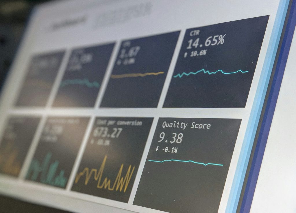
Conversion Rate
Using conversion rate alone is too simplistic and vague to yield meaningful insights. It overlooks important context, such as journey length, decision fatigue, and user intent. Just because users convert to paying customers does not imply that their journey was a positive one. For instance, if 50% of targeted users convert, that still leaves 50% who do not—what were the reasons for their lack of conversion? The conversion rate does not address this.
Session Length
While observing how users interact with a platform can be interesting, session length as a standalone metric is vague. Short sessions do not necessarily indicate an intuitive flow, and longer sessions may not mean engagement—they can also signify confusion within the flow.
Metrics That Should Matter to Designers
- Task Success Rate
Are users able to accomplish their intended tasks? This metric directly correlates with the usability of your product. A high task success rate indicates strong usability (or vice versa). - Time to Value (TTV)
This important metric helps designers evaluate how quickly users understand the interface and begin seeing a return on their investment, especially in SaaS products where users are focused on generating revenue. - Friction Points Per Flow
This metric uncovers the reasons behind user drop-offs. If users leave your platform, understanding the friction points in their flow is crucial. Are there multiple friction points in a particular flow? This insight provides actionable starting points for future projects. - User Struggle Indicators
Identifying small indicators of user struggle can help pinpoint issues within your product. Common signs include rage clicks, back-and-forth navigation, or feature avoidance. - Adoption of Core Features Over Time
Are users adopting core features or avoiding them? Are they trying new shortcuts that reduce their time on tasks, or are they sticking to old habits? This metric reveals whether users are merely “active” or truly engaging with the platform. - Retention Cohorts Linked to Feature Usage
If users are comfortable using specific features that simplify their experience, it’s likely that retention among these users will increase over time. Long-term user relationships are often driven by common behaviors, such as utilizing certain features.
By focusing on these metrics, designers can gain more meaningful insights that can lead to improved product usability and user satisfaction.