Journey mapping is one of the most widely used tools in interactive design, helping us create products and campaigns that connect with users on a deeper emotional level. This connection is essential for building long-term loyalty, where users and customers develop an irrational sense of trust and gratitude toward your brand.
An emotional journey provides a strategic perspective on how we utilize emotional design to shape user experiences. In this discussion, we will explore the 12 major emotional journeys, which will help you understand the different types of transitions that motivate and reinforce user behavior.
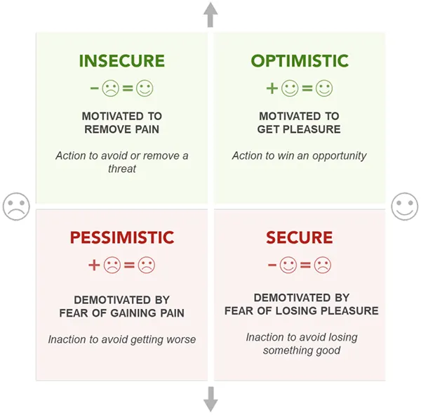
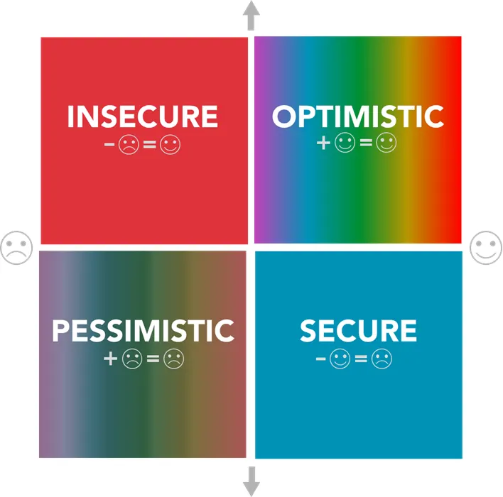
Cugelman Emotion Map
We will use the Cugelman Emotion Map to explain each emotional transition, examining them from a strategic standpoint. This model, developed in the Behavioral Design Academy, is based on neuroscience and the psychology of emotion. I have simplified it to assist designers in applying science-based emotional design strategies.
The Cugelman Emotion Map divides emotional experiences into four quadrants, each representing a broad emotional state that either motivates or reinforces people’s behavior.
Motivators vs. Reinforcers
People often confuse the terms “motivator” and “reinforcer.” While they are closely related, they are two distinct psychological principles that serve different purposes.
You can usually tell when someone misunderstands the difference because they use the term “carrot and stick” inconsistently—sometimes referring to it as a motivator and at other times as a reinforcer—without realizing they are blending these separate concepts. This confusion can hinder effective design and communication.
Applying psychology effectively becomes challenging when the fundamental principles are mixed up. Therefore, it’s essential to clarify the difference.
Motivators are design strategies that evoke excitement or fear about a future outcome. We use the term “motivator” to describe how emotional design can inspire a desire to act—either to gain something desirable (which generates optimistic emotions) or to avoid something unpleasant (which creates insecure emotions).
Reinforcers, on the other hand, are design strategies that provide either rewarding or painful experiences in the present. These are not about prompting immediate action, but rather about reinforcing behavior—shaping user habits by encouraging the repetition of rewarding experiences and discouraging actions that result in pain or frustration.
To further clarify, motivators stimulate emotional responses that drive people to take action, while reinforcers offer emotional rewards or punishments that shape behaviors over time. They influence whether individuals will repeat certain behaviors or avoid them in the future.
Motivators reflect emotional responses to anticipated threats we want to avoid or opportunities we hope to achieve. In contrast, reinforcers relate to the emotional experiences derived from our achievements—whether those involve positive emotions linked to success, which boost the likelihood of repeating a behavior, or negative emotions associated with failure, which encourage us to try harder or adopt a different approach.
While motivators inspire action, reinforcers teach us how to act.
Since emotions can be utilized both to motivate and to reinforce user behavior, understanding how they function provides us with a more strategic framework for designing emotional experiences.
Next, we’ll examine each quadrant in the Cugelman Emotion Map to better understand how these emotions operate, and then we will explore the 12 transitions and color psychology within each quadrant.
Motivators (Green Quadrants)
In the Cugelman Emotion Map, the motivator quadrants are represented in green, indicating “go.” These areas are where people feel motivated to act, driven either by opportunities that inspire optimism or by threats that invoke feelings of insecurity. Here’s a breakdown of each:
- Optimistic (High energy, positive emotion): This quadrant embodies emotions such as excitement, curiosity, and engagement. These feelings drive focus and encourage movement toward goals. From a strategic perspective, this is where we showcase incentives, highlight product value, and strive to meet our users’ needs. If you fail to evoke these emotions, your product may feel unmotivating. Conversely, if you overemphasize them, it might come across as overly sales-oriented.
- Insecure (High energy, negative emotion): This area encompasses stress-related emotions like anxiety, worry, and pressure. Strategically, we might use urgency, fear of missing out (FOMO), or other threat-avoidance strategies to encourage action. However, this approach requires caution; excessive use might be perceived as manipulative or excessively negative. Think of it as a spice: a little can be effective, but too much is overwhelming.
Reinforcers (Red Quadrants)
The reinforcer quadrants are indicated in red. These reflect the emotional experiences users have after taking action—whether rewarding or painful.
- Secure (Low energy, positive emotion): In this quadrant, users feel calm, trusting, and satisfied. Our goal is to have users land here, feeling confident that our product consistently meets their needs. This emotional state builds long-term loyalty, which is essential for designing a successful product. However, there is a downside; users may become complacent and disengage once they feel they have obtained what they wanted.
- Pessimistic (Low energy, negative emotion): Users in this quadrant experience feelings of disappointment, entrapment, or helplessness. It signals disengagement and carries the risk of customer churn. Remaining in this emotional state for too long can be dangerous, potentially leading to resentment. Resentment erodes loyalty and can drive customers away, damaging your company’s reputation and income. However, if your competitors leave their users stuck here, you have the opportunity to attract them.
This provides a basic overview of the Cugelman Emotion Map. Now, let’s explore the strategic use of these emotions.
User Journeys as Emotional Transitions
Years ago, I developed an interest in writing screenplays and read several classic books on the subject, including Aristotle’s Poetics. This 2,000-year-old classic analyzes theater and explains how stories resonate with audiences.
While reading it, I sketched a diagram of a play as a timeline with a curve representing emotional tone. This curve rises to high positivity and dips into lower negativity over time—similar to how we compose music, shifting between moments of high and low tension.
Years later, I discovered that Kurt Vonnegut used a similar framework to analyze the narrative arcs of literature, likely drawing inspiration from Aristotle. I also came across a scientific paper that applied AI to analyze the plot structures of numerous books using the same emotional diagram.
I have adapted this concept into the Cugelman Emotion Map, which we will use to understand the rise and fall of emotional tension as part of our emotional design strategies.
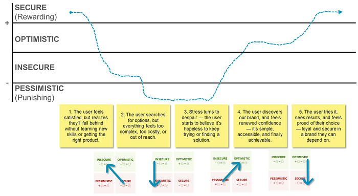
To show you how it works, let’s walk through a classic love story — between a frustrated user and an online product that steps in as the hero, solves their problem, and ultimately earns their long-term loyalty. In the chart below, you’ll see how each transition (in the Emotion Map) places our user in one emotional state before and another right after.
In this story, our user begins in a state of contentment but soon realizes they have a problem. They try to solve it, fail, and gradually sink into a sense of despair — feeling hopeless and ready to give up on finding a solution.
Then they discover your product, which sparks a sense of renewed optimism. They decide to give it a try. Your product delivers on its promises, and as the user starts to experience real benefits, their trust in your product and brand begins to grow.
If we continue to reinforce their trust by consistently delivering on our promises, the user may eventually feel something even more powerful: gratitude and the greatest prize of all — their loyalty. At this point, they’re not just satisfied; they’re emotionally invested.
The 12 Emotional Journeys
Based on four quadrants, there are 12 primary emotional journeys that represent every possible transition across various motivators and reinforcers. These transitions can happen quickly, but they can also unfold over a much longer period, sometimes taking months or even years, as individuals gradually shift from one emotional state to another. For example, someone might spend years feeling pessimistic about their life before a change occurs, leading them to find a new way forward.
To help you better understand these patterns, below is an overview of all twelve emotional journeys, including one detailed example for each quadrant.
Optimism Strategies
These are the most positive emotional transitions, where individuals pursue a goal with our support. If your primary aim is to encourage users to take a single action, one optimistic motivational strategy might be enough. However, in most cases, we use these strategies to prompt initial action, then focus on the secure quadrant, where we work to build a long-term, repeat relationship.
That said, optimistic emotions are our key tool for getting people started. Below are three common emotional journeys:
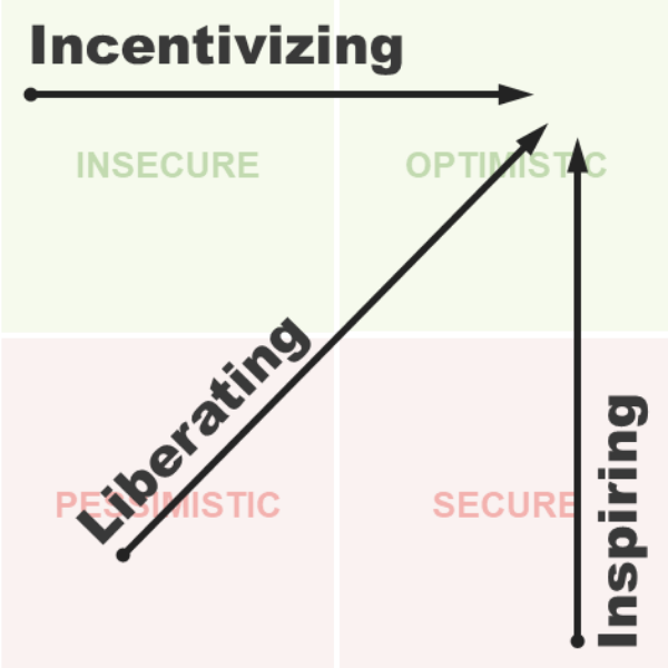
- Inspiring: Our audience is already content with their current situation, but by offering something truly exciting, they feel that things can go from good to great. This is how we ignite excitement for them to step outside their comfort zone.
- Incentivizing: Our audience feels pressure to avoid an imminent threat while gradually becoming optimistic that their chosen course of action will help them avoid that threat and gain benefits. Eventually, the positives outweigh the negatives, leaving our audience with a more positive outlook on the experience.
- Liberating: Our audience feels trapped in a hopeless situation, but when we provide the promise of escape or a positive change, their pessimistic despair fades in favor of optimistic hope.
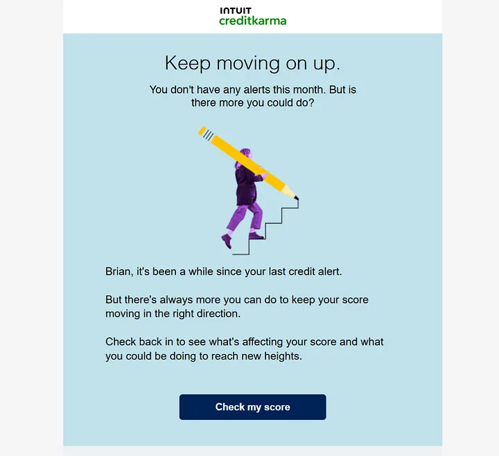
Credit Karma Aims to Inspire Users
Users often settle when their credit score is “good enough” and stop thinking about improvement. This is a common challenge in behavioral design. Once people achieve a goal, they tend to disengage, which is often when we see them regress.
While the ultimate goal of behavior change usually involves fostering long-term loyalty in the secure quadrant, once people reach this point, we typically need to shift toward maintenance strategies to encourage regular engagement. Credit Karma primarily uses inspiring tactics, motivating users with positivity and encouraging continued progress through uplifting, goal-oriented messages. Although there is a slight element of implied fear messaging, the overall tone is much more positive than negative, conveyed in a calming blue.
Insecurity Strategies
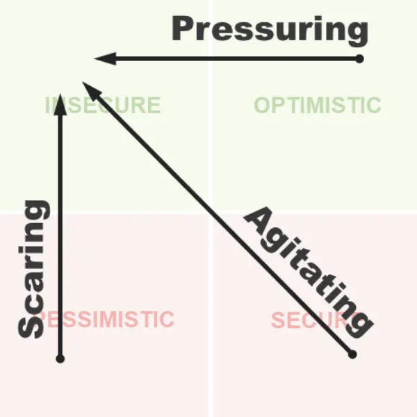
This quadrant involves using stress-inducing techniques that motivate our audience to move in the right direction or prevent them from heading the wrong way. I recommend incorporating a small dose of these techniques consistently. However, it’s important not to overdo them, as they can backfire if misapplied. Here are the three transitions:
- Pressuring — Our audience is on a positive path but then becomes aware of an emerging threat. This realization makes their current path more appealing because it will help them avoid imminent danger.
- Agitating — Initially, our audience feels secure, but this contentment shifts to stress as an emerging threat slowly takes over their thoughts, creating a sense of urgency to act.
- Scaring — Our audience feels trapped in an emotionally painful situation and experiences increasing anxiety, compelling them to act urgently to escape an imminent threat they may feel powerless to avoid. This is an extremely stressful transition, but it is a staple of political communications.
Booking.com Pressures Customers
Booking.com creates an optimistic atmosphere, making customers feel they can secure the room they want. However, they employ classic pressure tactics by informing users that others are currently booking the same room. This tactic pushes customers out of the comfort of their safe space and into a public arena where they feel they must compete to avoid losing the desired room.
The company uses friendly colors combined with alarming red to warn users to act quickly or risk missing out on a great deal. Users can read more about Booking.com’s social influence strategies here.
A common technique is to make users aware that if they don’t act quickly, someone else will seize the opportunity first, drawing them into a competitive game they never intended to play. Booking.com is well-known for this tactic, effectively heightening the pressure when users reach the booking page, warning them that they risk losing the room if they dare to close the page.
Security Strategies
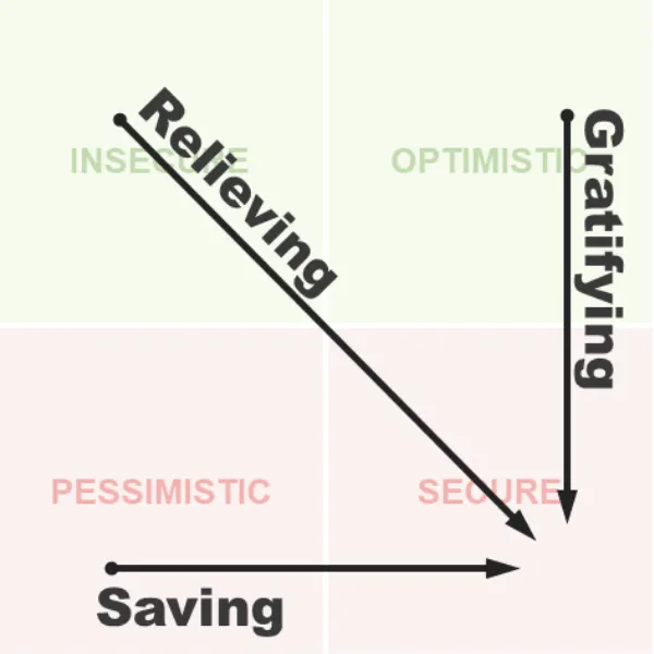
For most of what we do, this quadrant represents the ultimate goal of emotional design: fostering long-term, loyal relationships with our target audience.
When I refer to loyalty, I don’t mean mere repeat habits. I’m talking about a deeper connection — when your audience forms an emotional bond with your brand and begins to act in ways that may not always be logical. These individuals resist switching to competitors, even when presented with better deals, and may feel they are “cheating” on your brand because their loyalty feels genuine. These loyal customers often become brand advocates and drive referrals.
However, the downside of bringing people into this secure quadrant is that they can become complacent. This is why we typically shift to maintenance psychology once our audience reaches this stage.
Here are the three main ways we can establish security for our audience:
- Gratifying — Our audience actively pursues something motivating, feeling secure in their ability to achieve it or in the trust they place in us — ideally, our brand. This is the most satisfying and rewarding experience, nurturing trust and loyalty as our audience feels compelled to repurchase.
- Relieving — Our audience is working to avoid an imminent threat and then discovers a solution that, while not thrilling, effectively solves their problem, leading to a sense of relaxation and security as tension fades.
- Saving — Our audience feels trapped in a painful situation but then finds a solution that may not seem exciting yet lifts them from their distress, leaving them feeling secure and deeply grateful.
Zappos Gratifies its Customers
Zappos has earned a top reputation for exceptional customer support and has clearly learned a critical lesson: when customers are pursuing a goal, the company must assist them in achieving it and ensure they don’t feel trapped with unwanted products or unfair transactions.
What’s impressive about their website is how easily customers can find the support page. Not only does it provide a straightforward way to return products, but contacting the company is also simple. This stands in stark contrast to many other companies, where contact information is buried in the footer or hidden behind confusing and frustrating navigation.
When you call Zappos, you discover how they truly gratify customers and earn loyalty: by hiring support staff not just for their competence but also for their deeply empathetic personalities.
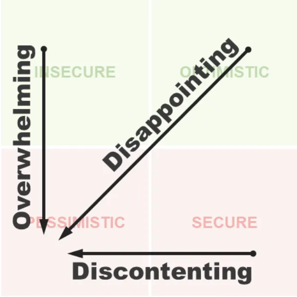
Pessimism Strategies
The last quadrant is the most negative—and the riskiest to navigate—as it involves our most disheartening emotions. Unlike secure emotions that build loyalty, this quadrant is where self-hate or long-term resentment towards your brand can take root—exactly the opposite of what we want to achieve.
Users can find themselves in this space intentionally due to sadistic design, but more commonly, it results from simple incompetence. Despite this, there are situations where it’s necessary to bring users into this emotional space—such as when they haven’t paid their bills or we need to discontinue an unprofitable product that people depend on. Whether you’re in damage control mode or trying to turn a negative experience into a positive one, understanding these emotions and how they function is critical.
The upside is that when your competitors have driven their users into this quadrant, those users may be ripe for defection. All you need to do is step in as a savior with a product that instills optimism, encouraging them to try something new.
Here are the three main ways users can end up in pessimistic emotional states:
- Overwhelming: Our audience tries to avoid a threat, but when escape seems impossible, they experience the consequences directly and feel trapped in helplessness.
- Discontenting: Our audience once felt secure, but as their sense of safety erodes, they begin to feel pessimistic, landing them in an emotionally punishing situation.
- Disappointing: Our audience pursues an exciting opportunity, only to find themselves worse off, where hope turns into disappointment, leaving them feeling trapped in a negative situation.
Temu’s Overwhelming Wheel of Hell
Temu has one of the most frustrating web interfaces that overwhelms users. Instead of allowing people to navigate their mobile website freely, they aggressively push users towards downloading their mobile app through manipulative design patterns.
When you search for products on their mobile web interface, a spinning gambling wheel pops up, forcing you to play a fake game, win a misleading prize, and then pressuring you to download their app to avoid losing it. If you don’t download the app, the same popup reappears whenever you return to the search results page, making the site extremely frustrating to use. Conversely, if you download the app, you risk installing potential spyware linked to the Chinese Communist Party. Either way, you lose.
To access their low prices, you must pay a hidden cost—either stress or privacy risks—both of which are undesirable. Therefore, the only reasonable choice may be to avoid using their product altogether.
Colors of Emotional Journeys
In visual design strategies, especially during transitions, color psychology can be a powerful tool to enhance emotional tone. However, before diving in, let’s clarify some common misunderstandings.
Universal Color-Emotion Claims are Misleading
Many claimed magical links between color and emotion are largely unfounded—ideas that have been invented, recycled, and reiterated over time. The design industry has long had a problematic relationship with color pseudoscience, but that approach is becoming increasingly outdated.
A new wave of research in color psychology and neuroscience is beginning to uncover real, scientifically supported connections between color and emotion. Unfortunately, much of this knowledge is still buried in academic papers. That’s why I, along with many others, am working to make this research more accessible.
Color-Emotion Associations are Context-Specific
Color-emotion associations are indeed real, but they are context-dependent. This means that color must always be evaluated within the situation in which it is used. When color and context align, the emotional impact is amplified; when they don’t, your message can lose its effectiveness and disrupt the user experience. This principle is known as color-in-context theory.
When a color matches the emotional tone of its context, psychologists refer to this as color congruency. A mismatch creates incongruency, which can lead to a subtle yet jarring feeling that makes it difficult for people to understand what’s happening, thereby eroding trust.
For example, if you’re shopping and see a red sticker on jeans you’ve been eyeing, you may feel excited—red signals a sale. But if you’re a crypto trader and see a red candlestick on a chart, your heart might sink—red signals a financial loss. In one scenario, red feels positive; in the other, negative. The emotional response comes not from the color itself, but from its meaning in that specific context.
This illustrates why blanket statements such as “red means danger” or “blue means calm” can be misleading. What truly matters is color authenticity—choosing colors that accurately reflect the emotional context rather than applying assumed meanings arbitrarily.
When color and context are congruent, design becomes more emotionally resonant and persuasive. Conversely, mismatched colors create friction. Congruent colors also enhance cognitive fluency, enabling users to process information more quickly, trust the experience more, and be more receptive to the message.
Color-Emotion Associations Are Rooted in Facial Perception
If color-emotion associations aren’t purely magical, where do they originate?
The common explanation points to culture. While cultural significance plays a role, growing research suggests a deeper origin: our ability to read emotional cues from facial color changes. Babies can identify five basic colors—purple, blue, green, yellow, and red—the same hues our brains use to interpret emotional signals in faces. Although cultural learning shapes these associations over time, the foundational training begins in infancy. Across all cultures, humans learn to associate certain facial color patterns with specific emotional states in particular contexts.
Context is crucial here. If someone apologizes but doesn’t blush, you might doubt their sincerity. What you might call “intuition” could actually be your brain registering the absence of a familiar emotional color pattern. Similarly, we assess health based on skin tone; for instance, a greenish hue might suggest illness to you, while a doctor might interpret it as a specific condition.
This process functions through subtle color patterns emitted by our faces based on blood oxygenation. Oxygenated blood creates red tones, while deoxygenated blood produces blue tones. These colors combine to create distinct facial color signatures for different emotions, which are visible across all skin tones. Individuals of all ethnicities can detect these shifts within their communities, regardless of melanin levels—this appears to be a universal human trait.
These signals are so consistent that researchers have developed video algorithms capable of estimating heartbeats and emotional states based on facial color shifts. When people view the color masks generated by these systems, they are surprisingly accurate at guessing emotional states, further validating the theory that facial color cues underpin emotional perception.
While cultural influences are real, our lifelong training to interpret facial color changes likely serves as the strongest source of our color-emotion associations.
We Project Facial Color Emotions onto Non-Human Objects
Research suggests that we unconsciously project facial color associations onto inanimate objects. Humans are natural anthropomorphizers; we assign human traits to animals, machines, and even inanimate objects. The fact that a “pet rock” can acquire a personality illustrates this tendency.
We don’t just see colors; we interpret them through the lens of human emotion. This is why a blue couch might feel “calm,” or a red button may evoke a sense of “urgency.” We are unconsciously applying the same facial color-emotion patterns we’ve observed in people to the world around us.
In a 2018 study, Thorstenson and colleagues asked participants to match objects, facial expressions, and emotions with different colors. While the matches weren’t perfect, the results showed a strikingly close correlation, supporting the idea that our general color-emotion associations originate from the emotional color patterns learned from our parents’ emotions and their facial signals.
Color Contexts of the Emotional Quadrants
Since color-emotion links rely on authentic, context-specific usage of color, I have merged findings from various scientific studies and mapped them to the Cugelman Emotion Map. This framework includes major motivational contexts behind emotional experiences, such as physiological well-being, safety, social bonding, status, and reproductive instincts (love, sex, parenting).
We will not delve into the full details here, but here’s a high-level overview of the emotional color quadrants:
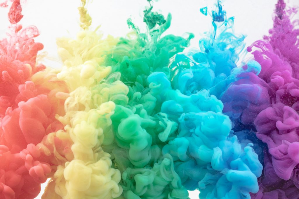
- Optimistic to Pessimistic Emotions: These range from vibrant rainbow hues in the optimistic quadrant to desaturated gray tones in the pessimistic quadrant.
- Insecure to Secure Emotions: These range from red, oxygenated blood tones in the insecure quadrant to calm, blue-hued blood tones in the secure quadrant.
This framework provides a basic color palette that effectively amplifies the emotional tone across the “12 journeys” users take as they transition from one emotional state to another.
Optimistic-to-Pessimistic Emotions: From Desaturated to Saturated Colors
When examining the motivational context of emotional quadrants, specific colors tend to emerge; however, the primary principle revolves around saturation. A well-known study highlights a clear pattern: optimistic emotions are closely linked with saturated, vivid colors—similar to those seen in children’s programming or rainbow imagery. These bright colors evoke feelings of excitement and energy.
In contrast, colors associated with pessimistic emotions become increasingly desaturated, often fading toward gray. These muted tones reflect a sense of loss, vitality decline, detachment, or emotional fatigue.
A classic example is the “before and after” narrative commonly used in marketing. The “before” scene usually features dull, desaturated tones, representing an uninspired or unfulfilled life. In contrast, the “after” scene bursts into vibrant, saturated color, signaling emotional uplift and positivity.
Optimistic Colors
Optimistic colors span the entire spectrum but often lean toward warmer tones. Generally, a diverse palette of saturated, vibrant hues conveys positivity and emotional energy.
Research on human facial studies indicates that red is connected with competitiveness, athletic performance, dominance, and social status. As red shifts toward yellow-orange, it can signal health and even sexual attractiveness—trends observed in facial color and dating studies.
However, red’s emotional meaning can shift dramatically depending on the context. While it can be used for optimistic emotions, I tend to avoid it as a strategic designer due to its potential to send mixed signals. In positive contexts, I limit its use, reserving it primarily for situations involving insecure emotions, where it carries more impact.
The guideline is clear: use a vibrant, colorful palette to represent optimism, but be selective about how and when to apply red.
Pessimistic Colors
Pessimistic emotions are best expressed through desaturated tones—colors that appear faded, aged, or washed out. As hues lose saturation, they naturally drift toward gray, reflecting emotional states such as sadness, depletion, or disconnection.
The connection between gray and depression is significant; it runs both ways. Individuals experiencing depression often perceive the world as more gray and tend to apply filters to their Instagram photos that appear bluer, darker, and grayer.
Some hues carry specific negative connotations. For example, green is often linked to illness and has been shown to reduce perceived attractiveness in dating studies. Greenish-yellow can indicate disgust, which aligns with its visible association with serious health conditions. Red may suggest blushing, embarrassment, or shame, while blue is closely linked to sadness.
I generally avoid using red and blue in pessimistic contexts, reserving them for distinctly defined emotional contrasts elsewhere in the palette. However, if used, they should be desaturated in depressive or low-energy contexts to maintain emotional accuracy.
Insecure-to-Secure Emotions: From Red-Blooded to Blue Tones
Facial coloration provides a clear explanation for our color-emotion associations. Specifically, the interplay between oxygenated red veins and deoxygenated blue arteries produces the wide range of facial colors linked to different emotional states.
While specific motivational contexts bring their own colors, the broad trend reveals a shift from red to blue across the insecure-to-secure spectrum.
A classic example can be observed in warnings, alerts, and system messages, which almost always use red to signal urgency or threat. Conversely, websites that aim to reassure users—such as those handling transactions or personal data—often use soft blues, gentle gradients, and calming hues to convey security and trust.
Insecure Colors
In states of insecurity—when people feel vulnerable, anxious, or threatened—red becomes a dominant color. It is consistently associated with perceptions of aggression and arousal, though its meaning depends heavily on context. A flushed face might indicate hostility during a confrontation or attraction in a romantic setting.
Because red is emotionally intense and context-sensitive, I primarily reserve it for anxious or threat-based emotions, using it strategically and sparingly in other contexts.
Darker tones can also express the intensity of insecurity, gravitating more toward deep black rather than neutral gray. These hues add weight and contrast, especially in high-impact or “reverse” palettes. Greenish-brown also fits into this emotional range, often indicating disgust or contempt and reinforcing the darker, more defensive aspects of insecurity.
Secure Colors
Lower blood oxygenation is associated with relaxed, stable emotional states, often reflected in blue-to-purple hues, with some slight extensions into red. These tones evoke calm, trust, contentment, and emotional stability—qualities tied to low-stress environments.
- Credit Dr. Brian Cugelman is a specialist in using psychology and data science for digital products.Dr. Cugelman leads the Behavioral Design Academy, offering training on applying psychology to technology.