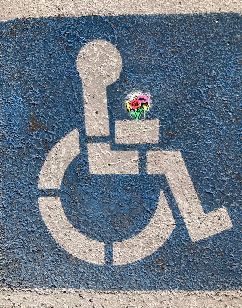
What Actually Changed
WCAG 2.2 became the legal standard (June 2024)
- New success criteria that break existing “accessible” designs
- Stricter cognitive accessibility requirements
- Focus on dynamic content and interactive elements
European Accessibility Act enforcement (June 2025)
- Affects all companies serving EU customers
- Includes digital products, mobile apps, and e-commerce
- Significant financial penalties for non-compliance
Section 508 updates in the US (October 2024)
- Federal contractors must meet enhanced standards
- Expanded definition of digital accessibility
- Requirements for AI-generated content accessibility
Emerging assistive technology support
- Voice control interfaces (Dragon, Voice Control)
- Eye-tracking navigation systems
- Brain-computer interfaces (early adoption)
- AI-powered screen readers with contextual understanding
The Business Impact Nobody Talks About
Legal risk has exploded:
- Accessibility lawsuits increased 320% in 2024
- Average settlement: $45,000-$75,000
- Class action suits targeting design systems specifically
Market opportunity cost:
- 1.3 billion people worldwide have disabilities
- $13 trillion in annual disposable income
- Most digital products capture <15% of this market
Technical debt reality:
- Retrofitting accessibility costs 6x more than building it in
- Inaccessible design systems require complete rebuilds
- Developer time spent on accessibility fixes increased 240%
The New WCAG 2.2 Requirements That Break Design Systems
1. Focus Not Obscured (Enhanced) — Level AA
Your focus indicators can’t be hidden by other content, even partially.
What breaks:
css
/* Old approach - focus can be partially hidden */
.modal {
  position: fixed;
  z-index: 1000;
}
.button:focus {
  outline: 2px solid blue;
  /* Outline might be hidden behind modal */
}
New requirement:
css
/* Focus must always be fully visible */
.button:focus {
  outline: 2px solid blue;
  outline-offset: 2px;
  position: relative;
  z-index: 10001; /* Above all other content */
}
/* Alternative: Ensure sufficient space around focusable elements */
.focusable-element {
  margin: 4px; /* Prevents focus clipping */
}
2. Dragging Movements — Level AA
Any functionality that requires dragging must have an alternative input method.
What breaks:
- Sliders without keyboard controls
- Drag-and-drop file uploads without click alternatives
- Sortable lists without keyboard reordering
- Image croppers without input-based cropping
Design system fix:
html
<!-- Slider with required alternatives -->
<div class="slider-container">
  <input type="range"
         min="0" max="100"
         aria-label="Volume level"
         class="slider-input">

  <!-- Alternative: Direct number input -->
  <input type="number"
         min="0" max="100"
         aria-label="Volume level (direct input)"
         class="slider-number">

  <!-- Alternative: Preset buttons -->
  <div class="slider-presets">
    <button aria-label="Set volume to 25%">25%</button>
    <button aria-label="Set volume to 50%">50%</button>
    <button aria-label="Set volume to 75%">75%</button>
  </div>
</div>
3. Target Size (Minimum) — Level AA
All interactive targets must be at least 24×24 CSS pixels, with exceptions.
What breaks:
- Close buttons smaller than 24px
- Pagination dots under 24px
- Social media icons under 24px
- Form field icons under 24px
Design system solution:
css
/* Minimum target size enforcement */
.interactive-element {
  min-width: 24px;
  min-height: 24px;

  /* For visually smaller elements, use padding to reach 24px */
  &.small-visual {
    padding: 4px; /* Makes 16px visual element = 24px target */
  }
}
/* Exception: Inline links within sentences */
.inline-link {
  /* Can be smaller if within paragraph text */
  min-height: auto;
}
Cognitive Accessibility: The New Design System Priority
Understanding Cognitive Load in Design Systems
The biggest shift in accessibility thinking: cognitive disabilities affect more users than motor or visual disabilities combined.
Cognitive accessibility principles for design systems:
1. Consistent Mental Models
Users shouldn’t have to relearn interaction patterns across your product.
Bad pattern:
html
<!-- Save button behaves differently in different contexts -->
<button class="save-draft">Save Draft</button> <!-- Auto-saves -->
<button class="save-changes">Save Changes</button> <!-- Requires confirmation -->
<button class="save-profile">Save Profile</button> <!-- Immediate save -->
Good pattern:
html
<!-- Consistent save pattern everywhere -->
<button class="save-action" data-behavior="immediate">Save Changes</button>
<button class="save-action" data-behavior="draft">Save Draft</button>
<!-- Visual indicators for different behaviors -->
<button class="save-action save-immediate">
  <span>Save Changes</span>
  <span class="save-indicator" aria-label="Saves immediately"></span>
</button>
2. Error Prevention and Recovery
Design systems must prevent errors, not just handle them gracefully.
Prevention-first form design:
html
<div class="form-field">
  <label for="password">Password</label>

  <!-- Real-time validation feedback -->
  <input type="password"
         id="password"
         aria-describedby="password-help password-requirements"
         data-validate="realtime">

  <!-- Clear requirements upfront -->
  <div id="password-requirements" class="requirements">
    <ul>
      <li data-met="false">At least 8 characters</li>
      <li data-met="false">One uppercase letter</li>
      <li data-met="false">One number</li>
    </ul>
  </div>

  <!-- Contextual help -->
  <div id="password-help" class="help-text">
    Choose a password you'll remember but others can't guess
  </div>
</div>
3. Reduced Cognitive Load
Minimize the mental effort required to use your interface.
Information hierarchy principles:
css
/* Progressive disclosure pattern */
.content-section {
  /* Show essential information first */
}
.content-section .details {
  display: none;
}
.content-section[data-expanded="true"] .details {
  display: block;
  animation: fadeIn 0.3s ease;
}
/* Clear visual hierarchy */
.primary-action {
  /* Most prominent styling */
  background: var(--color-primary);
  font-weight: 600;
  font-size: var(--text-lg);
}
.secondary-action {
  /* Less prominent but still clear */
  background: transparent;
  border: 2px solid var(--color-primary);
  font-weight: 400;
}
.tertiary-action {
  /* Minimal but discoverable */
  background: transparent;
  color: var(--color-text-secondary);
  text-decoration: underline;
}
Building Accessibility into Design Tokens
Color Tokens for Accessibility
Traditional design systems create color tokens based on brand needs. Accessible design systems start with contrast requirements.
Accessible color token structure:
json
{
  "color": {
    "text": {
      "primary": {
        "value": "#1a1a1a",
        "contrast-ratio": "15.8:1 on white",
        "wcag-level": "AAA"
      },
      "secondary": {
        "value": "#4a4a4a",
        "contrast-ratio": "7.2:1 on white",
        "wcag-level": "AAA"
      },
      "tertiary": {
        "value": "#6b7280",
        "contrast-ratio": "4.8:1 on white",
        "wcag-level": "AA"
      }
    },
    "interactive": {
      "primary": {
        "default": {
          "value": "#2563eb",
          "contrast-ratio": "4.5:1 on white"
        },
        "hover": {
          "value": "#1d4ed8",
          "contrast-ratio": "5.2:1 on white"
        },
        "focus": {
          "value": "#1e40af",
          "contrast-ratio": "6.1:1 on white",
          "focus-indicator": "#fbbf24"
        }
      }
    }
  }
}
Motion Tokens for Accessibility
Respecting motion preferences:
css
:root {
  --motion-duration-short: 0.15s;
  --motion-duration-medium: 0.25s;
  --motion-duration-long: 0.4s;

  --motion-easing-gentle: ease-out;
  --motion-easing-bounce: cubic-bezier(0.68, -0.55, 0.265, 1.55);
}
/* Respect user motion preferences */
@media (prefers-reduced-motion: reduce) {
  :root {
    --motion-duration-short: 0s;
    --motion-duration-medium: 0s;
    --motion-duration-long: 0s;
    --motion-easing-gentle: ease;
    --motion-easing-bounce: ease;
  }
}
/* Allow essential motion to remain with reduced intensity */
@media (prefers-reduced-motion: reduce) {
  .motion-essential {
    --motion-duration-short: 0.1s;
    --motion-scale: 0.5; /* Reduce motion intensity */
  }
}
Component Accessibility Patterns for 2025
The Accessible Button Pattern
Buttons are the foundation of accessible interaction. Here’s the complete pattern:
html
<!-- Complete accessible button -->
<button type="button"
        class="btn btn-primary"
        aria-describedby="btn-help"
        data-loading="false">

  <!-- Loading state -->
  <span class="btn-content" aria-hidden="false">
    <span class="btn-icon" aria-hidden="true">📤</span>
    <span class="btn-text">Send Message</span>
  </span>

  <!-- Loading spinner (hidden by default) -->
  <span class="btn-loading" aria-hidden="true" aria-label="Sending...">
    <span class="spinner"></span>
  </span>
</button>
<!-- Contextual help -->
<div id="btn-help" class="help-text">
  Your message will be sent immediately and cannot be edited afterward
</div>
css
/* Accessible button styles */
.btn {
  /* Minimum target size */
  min-height: 44px;
  min-width: 44px;

  /* Clear focus indicators */
  &:focus {
    outline: 2px solid var(--color-focus);
    outline-offset: 2px;
  }

  /* Loading state management */
  &[data-loading="true"] {
    .btn-content { display: none; }
    .btn-loading { display: flex; }
    pointer-events: none; /* Prevent interaction during loading */
  }

  /* High contrast mode support */
  @media (prefers-contrast: high) {
    border: 2px solid currentColor;
  }
}
The Accessible Form Pattern
Complete form accessibility:
html
<form class="accessible-form" novalidate>
  <fieldset class="form-section">
    <legend>Personal Information</legend>

    <div class="form-field" data-required="true">
      <label for="email" class="form-label">
        Email Address
        <span class="required-indicator" aria-label="required">*</span>
      </label>

      <input type="email"
             id="email"
             class="form-input"
             aria-describedby="email-help email-error"
             aria-required="true"
             aria-invalid="false"
             autocomplete="email">

      <div id="email-help" class="form-help">
        We'll use this to send order confirmations
      </div>

      <div id="email-error" class="form-error" aria-live="polite">
        <!-- Error messages appear here -->
      </div>
    </div>
  </fieldset>

  <div class="form-actions">
    <button type="submit" class="btn btn-primary">
      Create Account
    </button>
    <button type="button" class="btn btn-secondary">
      Cancel
    </button>
  </div>
</form>
The Accessible Data Table Pattern
Complex data made accessible:
html
<div class="table-wrapper">
  <table class="data-table" role="table">
    <caption class="table-caption">
      Sales Performance Q4 2024
      <span class="table-summary">Shows revenue, growth, and targets for each region</span>
    </caption>

    <thead>
      <tr>
        <th scope="col"
            class="sortable"
            aria-sort="ascending"
            tabindex="0">
          <button class="sort-button">
            Region
            <span class="sort-icon" aria-hidden="true">↑</span>
          </button>
        </th>
        <th scope="col">Revenue</th>
        <th scope="col">Growth</th>
      </tr>
    </thead>

    <tbody>
      <tr>
        <th scope="row">North America</th>
        <td data-label="Revenue">$2.4M</td>
        <td data-label="Growth">
          <span class="growth-positive">+12%</span>
          <span class="sr-only">12% increase</span>
        </td>
      </tr>
    </tbody>
  </table>
</div>
Testing Accessibility in Design Systems
Automated Testing Integration
javascript
// Component accessibility tests
describe('Button Component Accessibility', () => {
  test('meets WCAG 2.2 contrast requirements', async () => {
    const button = render(<Button variant="primary">Click me</Button>);
    const contrastRatio = await getContrastRatio(button);
    expect(contrastRatio).toBeGreaterThan(4.5);
  });

  test('has minimum target size', () => {
    const button = render(<Button>Click me</Button>);
    const { width, height } = button.getBoundingClientRect();
    expect(width).toBeGreaterThanOrEqual(24);
    expect(height).toBeGreaterThanOrEqual(24);
  });

  test('focus is never obscured', async () => {
    const button = render(<Button>Click me</Button>);
    button.focus();
    const focusVisible = await isFocusVisible(button);
    expect(focusVisible).toBe(true);
  });
});
Manual Testing Checklist
For every component:
- Keyboard navigation works completely
- Screen reader announces content clearly
- Focus indicators are always visible
- Color isn’t the only way to convey information
- Text meets contrast requirements
- Interactive elements meet size requirements
- Error states are clearly communicated
- Loading states are announced to assistive technology
Accessibility-First Design System Workflow
Phase 1: Accessibility Foundation
- Audit existing components against WCAG 2.2
- Create accessibility-first design tokens
- Establish testing workflows
- Document accessibility requirements
Phase 2: Component Enhancement
- Rebuild core components with accessibility built-in
- Create accessibility testing suite
- Train team on new patterns
- Update design and development processes
Phase 3: Systematic Implementation
- Roll out accessible components across products
- Monitor accessibility metrics
- Iterate based on user feedback
- Scale accessibility practices
The Business Case for Accessible Design Systems
Cost Analysis
Initial investment: 20–30% more design and development time
Long-term savings:
- 85% reduction in accessibility-related bugs
- 60% faster feature development (accessible patterns are reusable)
- 90% reduction in legal risk
- 15% increase in total addressable market
Competitive Advantage
- Most competitors are still playing catch-up on accessibility
- Accessible products often have better UX for everyone
- Strong accessibility practices attract top talent
- Positive brand association with inclusive design