As something that fills our eyes all day, color is essential in everyday life, especially in design. When a person looks at a design, colors are probably the first thing that catches their eye, followed by shapes and text. In video editing (post-production), there’s even a role called ‘Colourist,’ whose work hovers around color correction and grading.
In design, colors help to
- Ensure that the content resonates with Brand Identity: This includes creating a distinct look and feel per the business requirements.
- Evoke a Certain Emotion or Mood in the Audience: Think of how those warm colors on a food app make you feel while ordering your pizza, or how the cold dark-bluish hues help set the mood when the Night King walks into the scene in Game of Thrones.
- Communicate Without Using Text: Why use unnecessary text and clutter an app if a colored indicator such as red or Green can do the job and is more user-friendly?
Each color has certain emotions, connotations, ideas,, or objects associated with it (more on color associations later), and the choice of colors depends on What you want to convey and Who you want to get it. Therefore, anportant part of a designer’s job is to choose the right colors, or color combinations to be precise, to be used in the content (it can be a flyer for a school function or a website for a multi-million dollar company).
So how do we know which colors work well together?
This is where Color Theory comes into the picture, an intricate combination of science and art. But first, we should understand the different types of colors — remember primary and secondary colors from school?
Types of Colours
- Primary Colours are colors that aren’t made up by mixing other colors. Instead, think of them as independent, standalone colors and the starting point for all other colors — which means every other color can be created by mixing these in different proportions. These colors are Red (R), Yellow (Y), and Blue (B).
For digital and online purposes, Red-Green-Blue (RGB) are usually the primary colors because all colors are mixed and rendered in combinations of Red, Green, and Blue on electronic sensors and digital displays. In this format, the primary colors (R-G-B) combine to form pure white color. - Secondary Colours are one step further and are obtained by combining two primary colors. As you might recall, Red and Yellow together make Orange; Yellow and Blue make Green, and Red and Blue make Violet. In the RGB format, Red and Green make Yellow, Green and Blue make Cyan, and Blue and Red make Magenta.
- Tertiary Colours, which are one further step away from secondary colors, are arrived at by combining primary and secondary colors. For example, Red and Orange combine to form Red-Orange, and Yellow and Green make Yellow-Green.
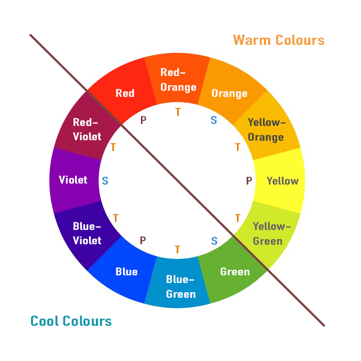
This sequence can go on and on indefinitely, combining colors iteratively at each step to form millions of newer colors — each one unique and slightly different. For illustration purposes, the significant colors can be represented in the form of a simple color wheel (see below – colors are marked as P, S, and T). The primary colors occupy three major sectors of the wheel, and different colors are iteratively added in between.
Colour Temperature
Another frequently used terminology that most of us might already be familiar with is Warm and Cool Colours. Warmer colors tend to be on the orange-ish end (Red-Orange-Yellow-Brown etc.), and more excellent colors on the blue-ish end (Blue-Green-Aqua-Cyan-Purple, etc.). In the below color wheel, a line separates the two.
If you have ever used Lightroom for photo editing, you will notice a Temperature slider. As you increase the temperature and make it warmer, the image takes an orange-ish hue, while the opposite lends a colder, blue-ish hue.
Warm colors are usually associated with sun/summer, daylight, warmth, and life and generally depict a happy or cheerful mood, while cool colors represent the opposite: winter, night, cold, death/decay, and a sad mood (this is not cast in stone though, and largely depends on the context in question). Therefore, warm and cool colors are frequently seen in cinematic movies, where the color grading and temperature impart mood to the scene and evoke the desired emotions in the audience.
Before we move forward, we must understand a few other terms closely associated with colors which will help us understand the infinite variations of more OK colors that occupy our world and screens. These are:
- Hue: The word ‘hue’ is used interchangeably with color; rightly so — it’s just another word for color. There are two notable exceptions — White and Black. These are called achromatic colors (colors that don’t have a hue).
- Saturation: This captures the intensity of the hue and determines how vibrant or subtle it is, ranging from full saturation on one end to grey (saturation of 0) on the other extreme. Think about editing an image on your phone and how the appearance changes when we increase the saturation of one or more colors. When we reduce the saturation to 0, only blacks, whites, and greys remain.
- Value or Luminance: This determines how dark or light the color is. Think light Red vs. dark Red. At the extreme ends, a stain would become darkest (minimum value) or lightest (maximum value), while the mids lie in between.
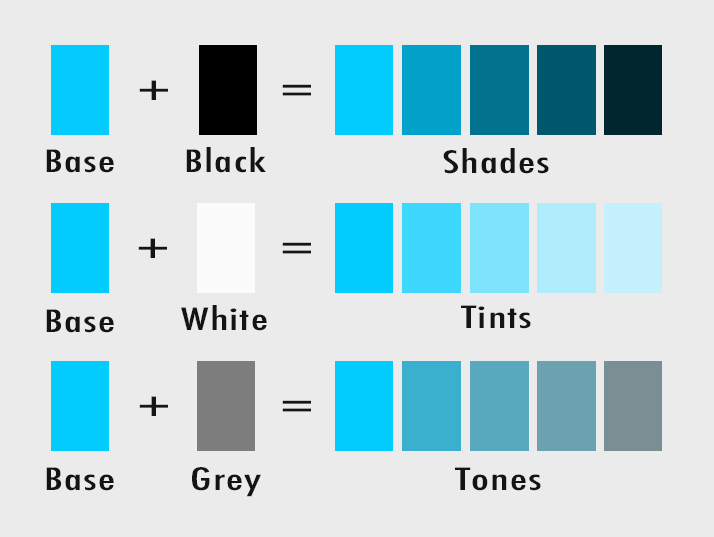
- Shades: A shade is obtained by adding black to the base hue, making it darker and more intense in appearance. The maximum would be pure Black.
- Tints: A tint is obtained by adding white to the base hue, making it lighter and more subtle in appearance. As expected, the maximum would be pure white.
- Tones: A tint is obtained by adding grey (a specific proportion of Black & white) to the base hue, making the color gradually duller in appearance. Tones lie in between tints and shades.
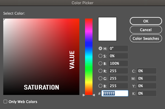
Look at the red box below, taken from the Colour Picker in Adobe Photoshop. If you move horizontally from left to right, the saturation increases from a fainter, almost desaturated red to a more vibrant red. If you move vertically down along the box, the value is in increases from lighter to a darker red.
Different combinations of saturation and value produce different shades, tints, and tones of Red. Another way of saying the same thing in a more artistic/natural sense (imagine paints on a color palette instead of tweaking sliders on digital software) is that mixing different amounts of black, white, and grey with the base hue produces different shades, tints, and tones, as illustrated below.
Color Associations
Each color has certain emotions, connotations, ideas, or objects mainly associated with how humans interact with the colors we see in the natural world. Although color associations are subjective and vary from one context to another, some broad associations which generally apply are as follows
- Y.ellow — Probably the most visible color from a distance (hence frequently used in safety signs). Yellow is the best color for grabbing the viewer’s attention and is very vibrant. Think of Sunshine and Sunflowers. It is typically associated with Joy / Optimism / Playfulness / Happiness / Richness / Attention / Food Items.
- Red: Red is a stimulating, exciting color that quickly grabs your attention and is typically associated with Love / Passion / Vitality / Energy / Intensity / Danger / Ange,r.
- Green — Nature / Environment / Renewal and Growth / Money / Freshness and Food items / Islam (religion) / Go-ahead or Safe (hence project managers report project status as green when there are no issues).
- Blue — Royalty / Military / Nature (Sky and Sea) / Business (Trust and Professionalism) / Stability & Calm / Male (sex). You would often notice Banks, Insurance providers, and Mutual Funds using blue in their branding and working professionals using many blue templates in their presentations — blue instills confidence and espouses a serious vibe.
- Purple — Royalty & Nobility / Luxury & Wealth / Premium
- Black — Probably one of the most versatile of the lot, the darkest color on the spectrum is typically associated with wide-ranging themes such as Evil / Darkness / Sorrow / Seriousness / Premium / Eleg,ance. Its versatility is the reason Black is used on most premium credit cards as well as in funeral attire.
As a general note, bright colors impart a fun or modern vibe, while desaturated/dull colors more have formal and business-like look and feel. For a more detailed understanding of colors, their histories, associations, and meanings, check out this detailed resource by Canva.
Now that we understand different colors, it’s time to get to…
Color Combinations
Any piece of visual content, be it an illustration or an animation, would typically use 2 or more colors. Imagine text, icons, foreground elements, and background. Not every color works with every other, and color that look good together from Colour Harmony or a Colour Scheme. Colour combinations must ensure that the design is visually pleasing, has adequate contrast, is coherent and easy on the eyes (no one likes an eye sore!), and is legible.
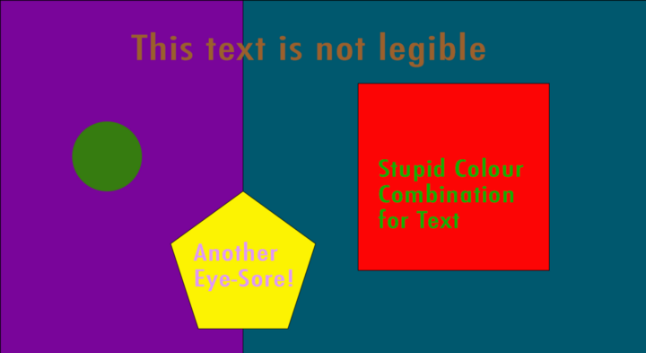
Colors that don’t work well together (see below) are a strict No!
Don’t worry; there are tried-and-tested methods of arriving at suitable color combinations, and we designers must understand and apply them correctly. There are 6 types of color schemes. Remember that these are just guiding points, and you can play around using the same principles to get your variations.
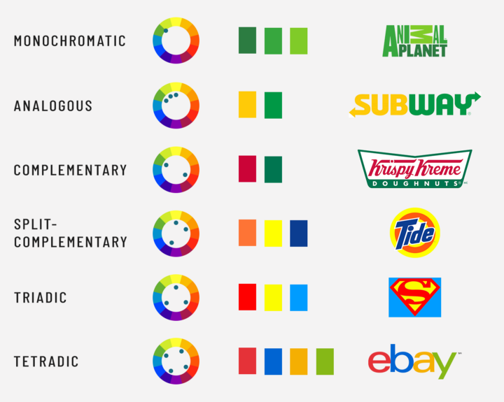
- Monochromatic: Probably the simplest of all, this color scheme uses a single color. Since there is only one color and we can’t add other colors, the only variations possible are by altering the Saturation and Value — to get various shades (darks), tints (lights), and tones (mids) of the same color.
While using a monochromatic scheme, a good match is guaranteed, as we use subtle variations of the same color to produce a relatively relaxed and less contrasty visual appearance. A quick example is the Animal Planet logo (see below), which uses multiple variations of the same color: green. - Analogous: This color scheme uses 2–4 colors that are adjacent to each other on the color wheel, like reds & oranges, blues & greens, etc. This ensures that they are close in appearance. Analogous color schemes generally have lower contrast (think of the contrast between yellow & Green vs. yellow & Violet) and are abundantly found in nature. The Subway logo, which combines yellow and green, is an excellent example of this scheme.
- Complementary: Complementary colors lie opposite each other on the Colour Wheel, leading to high contrast and a bold appearance. For example, look at Orange and Blue on the Colour Wheel above — they are at opposite ends. FedEx and Firefox use these two colors in their branding to significant effect, while Mountain Dew and Krispy Kreme use Red and Green (another complementary combo) in their logos.
Complementary schemes can be visually attractive, but since both colors are so entirely different, there is always a risk of them overpowering each other. If you don’t want a overly simplistic or contrasty look, you can always play around with different shades and tints of the hue(s) to get a subtler look. - Split Complementary: This color scheme uses 3 color three — a base color and the 2 colors that lie on either side of its complementary color. So, for example, if Red is your primary color, instead of using Green (which complements Red), you can go for Blue-Green and Yellow-Green, which can be found on either side of Green on the Colour Wheel. As expected, this will yield slightly lower contrast than a complementary scheme, but more importantly, it gives you more colors to choose from and probably more exciting results. A close example I can think of is the logo of Tide, which uses variations of Orange, Yellow and Blue hues.
- Triadic: This scheme uses 3 evenly spaced colorspace on the color wheel (thus forming an equilateral triangle). Remember that the primary colors R, Y, and B are also evenly spaced? Since triadic colors are so distant from each other on the wheel, the appearance may not be straightforward on the eyes, especially with primary and secondary colors (imagine Orange, Green, and Violet in the same image). Thus, it takes more significant effort and understanding to apply this scheme correctly without it being an eye sore. Superman’s logo, which uses Red, Yellow, and Blue, comes to mind.
- Tetradic or Double Complementary: As the name suggests, the scheme uses 4 color four which are complementary pairs (thus forming a rectangle on the wheel — see below). The double complementary method is associated with high contrast on the same lines as the complementary scheme. This is probably best applied where one color is allowed to dominate while the others serve as additional colors, aiding in complementing and contrasting the primary color. Ebay’s logo uses a tetradic color scheme.
Please understand that a color wheel is just for our understanding and shows only 12 out of the millions of possible colors we can use in our designs. In the real world, designers take color schemes as guidance and inspiration and would always introduce subtle variations to make their designs unique.
How to use color palettes in practice?
In practice, we would pick a base color for our designs and then a palette to go along with it. There are multiple online sources where you can find an endless number of color palettes (and generate your own).
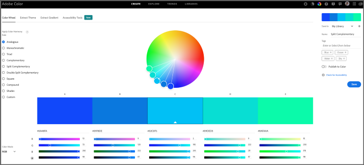
One resource I generally use and recommend is Adobe’s Colour Wheel and themes. Here, you can
- Select the broad color scheme or color harmony rule that you want to use
- Play around with the sliders and circular controls to create a virtually endless combination of colors, changing the hue and saturation as required. Each color is represented by a hex code (#RRGGBB), lying between Black (#000000) and White (#FFFFFF), and the codes can directly be used when picking colors colors in digital editing software.
- Save your color themes in the library for use and future reference. You can export your articles and also create new libraries if required.
- Check your color palette for accessibility: You can check the contrast ratio between your primary and body/text colors. Web Content Accessibility Guidelines (WCAG) define minimum color contrast ratios for legibility — it’s good practice to ensure your choices adhere to this so that the colors used are distinct and safe for color-blind viewers.
- Extract and use the color palette from any existing image or design (by uploading a file).
- Check the latest color trends used by artists and designers across different industries.
Lastly, you must take inspiration from the work of other creators and keep experimenting — this will go a long way in improving your understanding and application of colors.
Some Quick Tips:
- It’s a good practice to pick the first color (base hue) as per the desired associations, emotions, or brand identity resonance. After the base color is finalized, you can choose the supplementary or secondary colors from the color wheel depending on the color scheme you want to use.
- Contrast is extremely important when using colors — colors should be such that the design has adequate contrast. Combinations involving all-light/subtle or all-dark/dominating colours should be used carefully.
- If you are using color combinations that don’t seem to be going together or have a low contrast/legibility (e.g., two strong colors like red and green), it’s helpful to play around with the saturation and value (lightness/darkness) of one color, till they gel well.
- The readability of the text is extremely important in the design and depends a lot on the contrast between the color of the text and the background. Sometimes, it makes more sense not to use hues for text and stick to neutral colors like white or black against a contrasting (but pleasant) background.
- It’s good to be a minimalist and keep it simple when using colors. Remember, less is more. Each colour should serve a purpose and justify its presence in your design. Nothing kills a design more than force-fitting a bunch of unnecessary colors into it and cluttering it up.